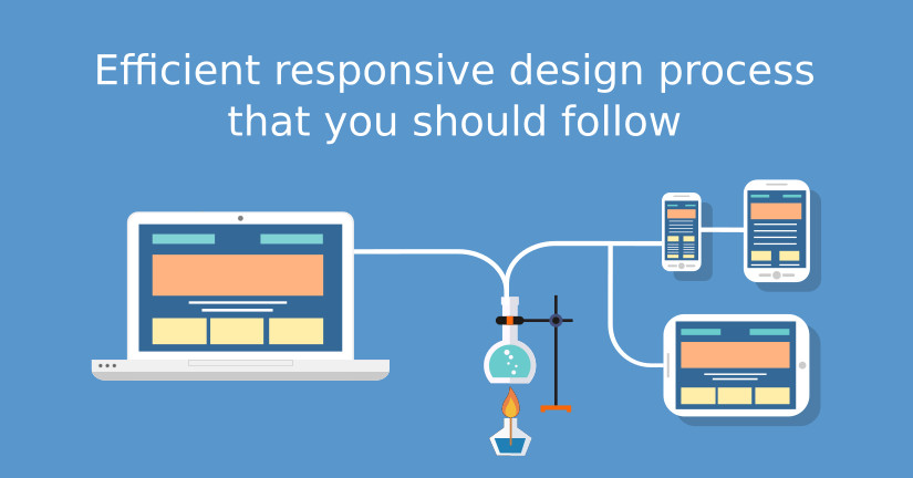
Efficient Responsive Design Process That You Should Follow
Responsive design has no longer remained as a jargon! It is what almost every webmaster and designer is well-aware of. In spite of so much awareness, the workflow of responsive design still remains very mysterious.
Imagine the struggle of reaching a destination when you are not aware of the exact directions! Not anymore. To make your task easier and to ensure that you have the best responsive design in accordance with the industry’s standards, let’s have a look on an effective responsive design that you should follow to ensure the best results every time.
Get hold of content
This is what is mistaken hugely by various web designers. Web designers normally start by designing the web page and then ask the content writer to stuff the page accordingly with the content.
This is where you are wrong. You should plan and get hold of the content even before you start designing any website. So here is a quick process that you should adopt to set the content right:
- Ask your content writer to provide you with the content.
- Find complementary images, logos, and texts related to it.
- Now lay out your website on a Google doc or any similar platform and plan your content. Keep it on the places you want to showcase with appropriate CTAs and the likes.
- Do as many changes as you want till you are happy with the final output.
- Keep your content focused on the target market.
Get set to designing
Once you are fully satisfied with the content that you have, it is now the right time to start designing in the context of the content you have just finalized. Make use of content and wireframes and content to design mockups.
You might like to start with a free PSD template or start everything from scratch – it all is dependent on the requirements and the documentation received to you by your client.
Pay emphasis on important and not-so-important stuff
You would need to identify the important elements that you want to put the focus on. it might be an ad block or a banner or a post or media –whatever it is. It is important to analyse the important of them and design accordingly.
Focus on typography rather than on decoration
Unfortunately, designers often end up being bifurcated from their basic aim. Instead of focusing on usability and user experience of a website they are working on, they start focusing more on decoration and other ornamental objects. While the website might look catchy and beautiful that way, but if the basic navigation or the fonts are messy, no matter how beautiful your website is, it will still fail to attract your target audiences.
Thus, typography should be the first priority that you should have. There are various tools available that can help you in meeting the purpose. Typecast is one of them. Analyse your typography before you start working on the PSD version of your design to save time.
Simulate your design with respect to mobile
You won’t know how your design looks on mobile if you are working on a desktop version and vice versa. It is good to have an idea of the two platforms, but the exact position would be revealed only when you check your work on mobile and vice versa. Supposedly, you are working on the desktop version of the website. When things seem to be perfect to you and you are okay with everything, try checking your work on mobile and see how things are doing. Are images perfect? Is the message behind the website conveyed? If not, try altering your design keeping the mobile screen in mind.
Check your work on various screen sizes from tablets to smartphones and desktops – see if everything is as intended or are you missing anything?
Check the design’s compatibility with various browsers
Not to forget, it is no more about the responsive design and mobiles; your website should be cross browser compatible too. Check if your design is rendering perfectly on all major web browsers like chrome, firefox, safari, opera mini, UC browser and so on. If you have already started the front-end development, it is all the more necessary to see if all CSS and JS are called properly.
Push the design to development
When you seem to be satisfied with all these major factors, it is time for you to push the design to development. During development, make sure that the developer has a pixel-perfect mockup with all texts, images, and videos.
Even pixel perfect mock-ups fail to deliver the perfect info at times. For example, if your design has some interactive functionality embedded like animation and other effects, it might not be clear to the developer as this is not clearly visible in the mock-up. It is, therefore, necessary that proper communication is maintained between the designer and the frontend developer.
Keep These Things In Mind While Designing
- Put your focus on screens rather than on devices
- Have consistent navigation throughout all screens
- Follow mobile first approach
- Check the performance of your website on various screens
- Run rigorous testing
Wrapping Up
To conclude, the whole process of responsive designing is no rocket science. It is just a systematic approach towards designing which ensures that your website is rendered perfectly on varied screen sizes. To begin with, you need to get hold of the content from where the basic foundation of your design is laid. Then, look things from a mobile perspective and keep bringing changes as you proceed.
This might sound like tough on the first go, but you will surely go better in this going forward. If it still sounds like not your cup of tea, why not to give Template Toaster web design software a try? Themes generated by Template Toaster are responsive on the go and meet all the industry’s standards!
[call_to_action color=”gray” button_icon=”download” button_icon_position=”left” button_text=”Download Now” button_url=”https://templatetoaster.com/download” button_color=”violet”]
Create Responsive WordPress Themes in minutes using TemplateToaster website builder
[/call_to_action]
Build a Stunning Website in Minutes with TemplateToaster Website Builder
Create Your Own Website Now
Great article thanks for sharing this to me.This is very helpful in making my website.hope others will see this also.