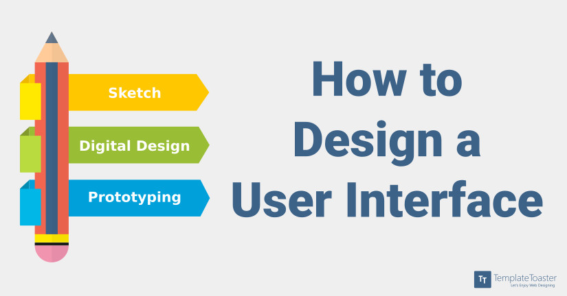
How to design a user interface?

Now that you have decided to start a career in User Interface Design, you must be wondering where to start from. One of the biggest milestones in designing an interface is getting inspiration. After having thought of an idea it is time to sketch it up and convert what’s on paper into digital. This article will take you through all these steps and also suggest specific software to use for that “picture perfect design”.
Inspiration
When it comes to designing interfaces it is not just about buttons or text boxes; the very reason of calling UI Design a design asserts that it is “ART”. Even a very creative person needs some kind of inspiration to expand his vicinity.
You can find inspiration from an interface you used and relished or even from an interface you didn’t quite like but would want to make changes in.
Dribbble, show and tell for designers, is the perfect place to explore ideas from. You will also see yourself uploading your work on Dribble in no time and get reviews from fellow designers.
Muz.li is a single stop for all your needs, design. Muz.li has a plethora of content for inspiration, from cool CSS libraries to the best-awarded websites. It has a weekly inspiration section of interaction design which is great for User Experience designers.
Stories by Nick Babich for UX Planet are one of the best writings for a UI/UX lover.
Sketch and wireframe:
You have to know what the user wants and wireframing is the cheapest step where you can make all the mistakes. A user flow in mind should definitely help you to make a wireframe which makes sense both to the user and the developers.
“Pen is mightier than a mouse and even a keyboard.” After being inspired and an insightful wireframe in mind you can start making sketches. The beauty of UI design is that you need not be a sketch artist to create a beautiful interface. You can create a number of interface sketches based on the wireframe and can finalise one after all the brainstorming. Empathy also plays a big role in developing sketches to make a user-centered design. A rough idea of placement of elements acts as the backbone of our next step, Digital Designing.
Digital Design
After finalising a blunt interface from your sketch you can start with creating the same on a software like Sketch or Adobe Illustrator or Hype. This is the time when you can think of a colour palette in mind, sizing of elements, placement of the logo or any other attention to detail for that matter.
You can reason behind the placement of elements and micro-interactions by empathising and relevance to context. Basically, having a user-centered approach while designing pumps up the user experience of an application. You can visit this link for a deeper understanding of user-centered design.
https://blog.templatetoaster.com/keys-good-design-empathy-motion-relevance/
Sketch 3.7 is one of the best software one can think of when it comes to designing interfaces. Sketch has templates for almost any device which gives a kick start when developing for a particular device in mind. Developing login pages, splash screen or dashboards becomes easier when you have default interface elements right at your disposal. Sketch 3.7 does a very good job with reusable elements (symbols) and is a game-changer for designers.
Adobe Illustrator, when it comes to vectors is the best tool for designing. Though it has a learning curve to it which when mastered, would make you never look any place else.
Hype 3 is also a tool which works entirely on vectors and is promising for designing interfaces and even prototypes with full-fledged animations to elements and screen transition effects. It is a great tool for designing full mock-ups of web applications or mobile applications. You can also import a Sketch file over Hype and continue from there.
TemplateToaster will be best solution to convert your imagination into reality if you are going to do a HTML5/CSS5 website or a CMS Template.
Prototyping
Prototyping is done when you have to present mock-ups of an interface. A working replica of an interface gives a feel of a real application without even starting development of the back-end. This saves a lot of time and effort because changes made now would be cheaper than the changes made after back-end development.
Marvel allows you to create prototypes by linking different designs from almost anywhere and create a linked interface with full animations and gestures to give a feel of a real app or website.
Principle for mac is a tool which allows you to give animations to your designs. From subtle micro-interactions to full-screen rapid transitions, everything is possible via Principle. You can easily import a Sketch file and animate smallest of elements in no time, it is this easy.
Proto.io is another prototyping tool which you can use to give life to your static designs and develop full mock-ups. There is a myriad of examples of interactions and animations which can get you inspired in no time.
In the end…
Think of a user flow which makes sense by empathising a user and develop a wireframe according to that. Jot down all the terminologies and steps and be aware of the context of the app or website you are trying to design. Sketch it up and brainstorm and then sketch it up again. When you feel comfortable with the design open up Sketch or Illustrator and start designing. If you are designing multiple screens use a prototyping app to give life to those animations. Spice it up and show it off on Dribble.
Happy Designing!
[call_to_action color=”gray” button_icon=”download” button_icon_position=”left” button_text=”Download Now” button_url=”https://templatetoaster.com/download” button_color=”violet”]
Design stunning Websites in minutes using TemplateToaster web design software
[/call_to_action]