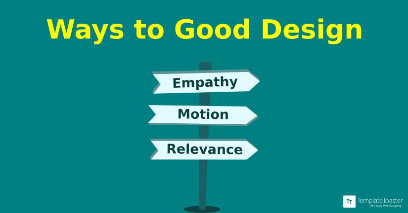
Keys to a good design are – empathy, motion and relevance
Incorporating flat design and material effects does make the UI look subtle, its easier on the eyes, the open spaces depict a wideness in thought, the colours aren’t flashy and, don’t come in the way and its a breeze to interact with. But, these are just some design elements which have predefined ways of implication like material UI has its own set of guidelines. It is important to understand that for a UI, the priority of its look and feel is secondary and is preceded by the relevance of context. Sure, these must go hand in hand but what use will these beautiful elements be of, if the interaction seems to deflect from logic.
Empathy, motion and relevance are just some keys to creating experiences that not only help the user accomplish a task but also feel satisfied. This is not a ladder to climb but a triangle, where these phenomena amalgamate to produce a helpful, meaningful and relevant solution.
Empathy:
Empathy, in design, is understanding the user’s perspective. It is important to see through user’s glasses to know what problems one might face while interacting. Empathising a user helps designers understand the attention to relevance required to create meaningful interactions i.e. creating wireframes custom stitched for the best experience possible.
Motion:
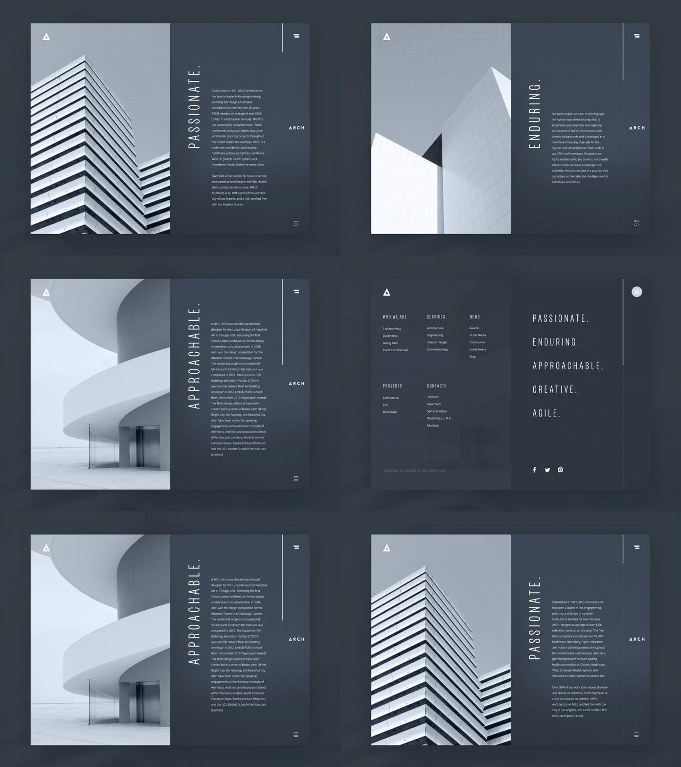
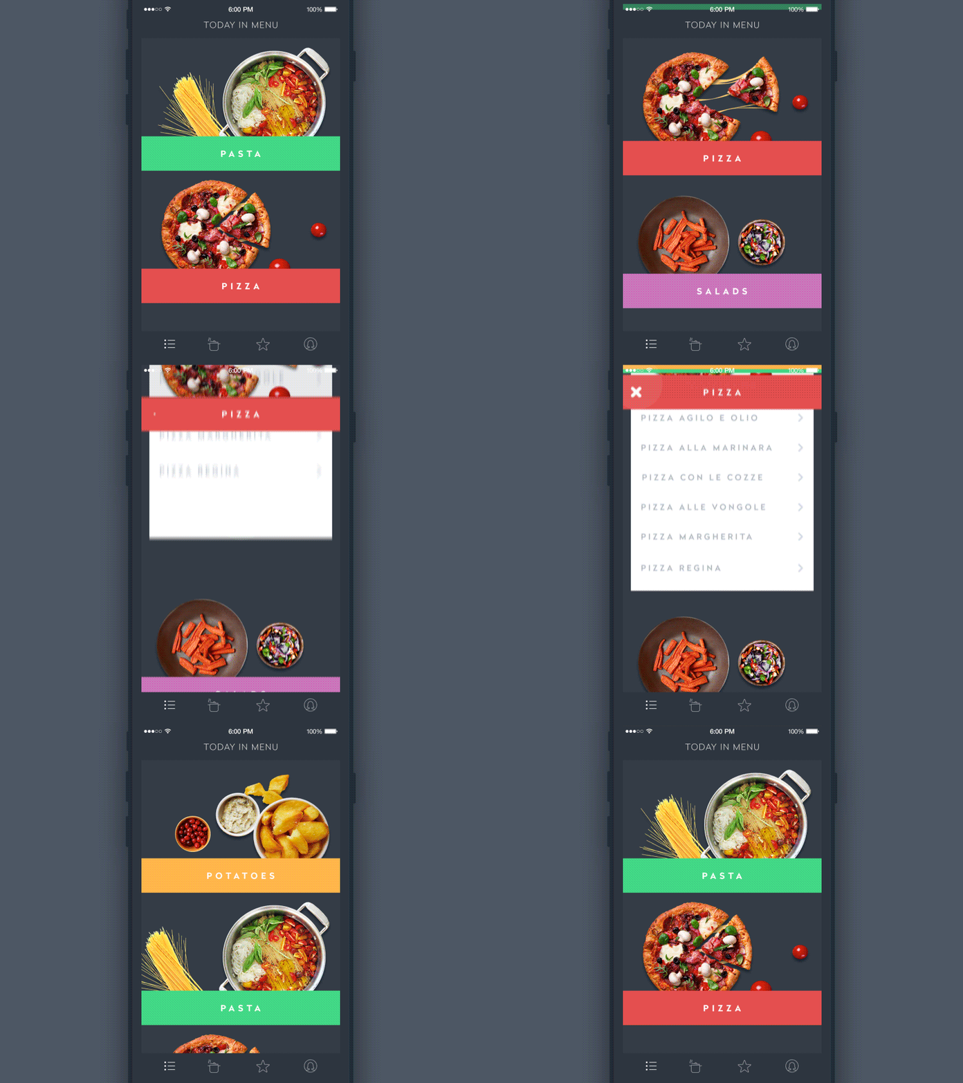
The act of a static element getting a life is called animation. Nowadays, when we look at a website we expect it to be responsive, it is almost like the bare minimum, even for a layman with minimal exposure. Animations are like the baseline for a website or an app. This motion, however, makes elements feel a bit real even if it is not quite replicated to actual life, it is always a delight for the eyes.
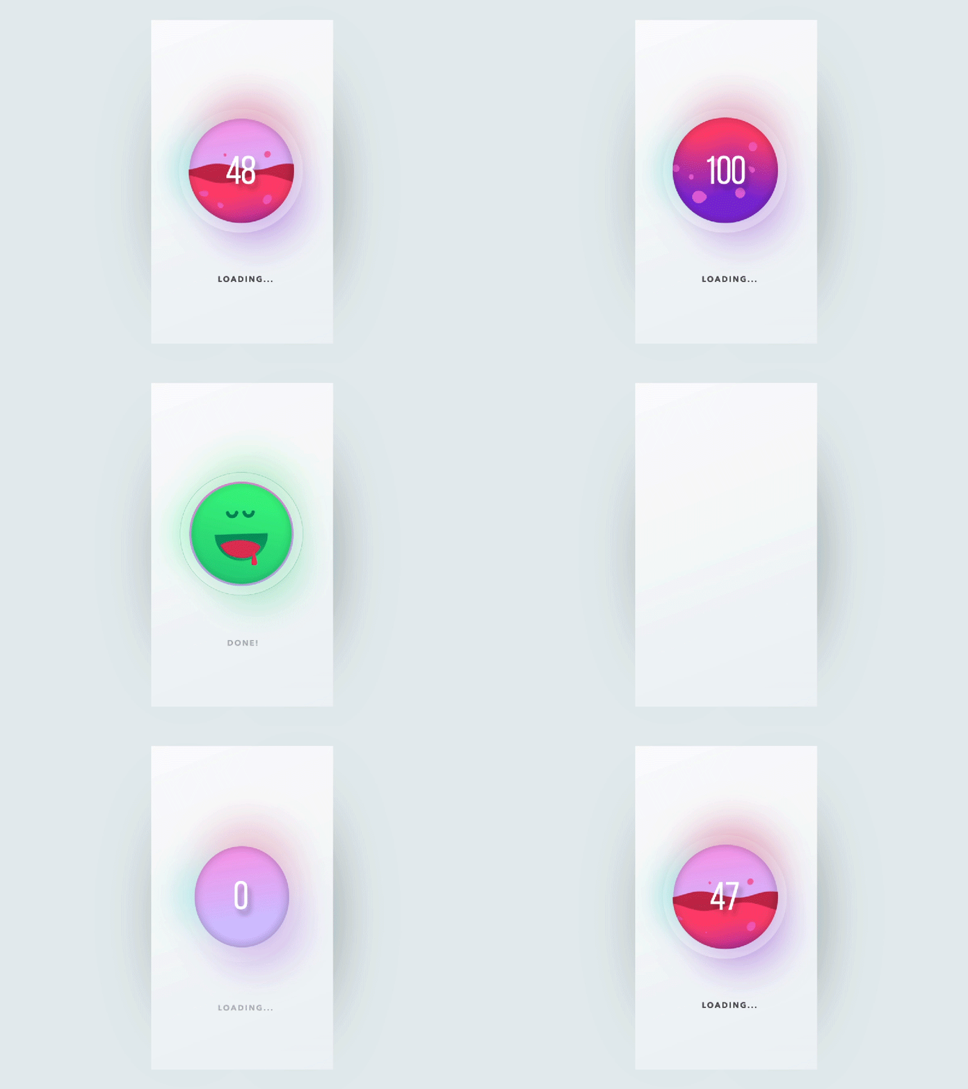
A motion shouldn’t be there just for the sake of it, it should have a purpose. Motion helps communicate in the most natural form. A motion should convey something and be subtle at the same time. It should help highlight what a user can do next and be meaningful enough to keep the user posted about what’s happening (e.g. display progress).
Animations take the UI interaction to a whole another level because they make sure that the users aren’t just tapping on the screen or using a mouse and hovering it to objects, instead, they make the users feel like they are interacting with something real. It is always good to know that things are responding to your actions, that’s basic human nature.
Motion establishes mood and reaction. A good animation abides by the laws of physics making the users relate the animated element to a real life one which he can interact with.
Source: Dribbble by Sergey Valiukh
What should not be neglected when using motion design?
Context:
A website focused on readable content (e.g. Quora) may not have as many animations as compared to a music service website (e.g. Spotify). So, knowing the context is crucial when using motion design.
Performance:
If an animation is slow or stutters, it has already lost the reason of its existence. So, it is very important to consider the type of devices a website is being designed for.
Distraction:
Some animations add up to the time taken in performing an action which is superfluous. If an animation is not solving any problem or isn’t really giving any feedback it is better to omit it. A designer has to understand the usability and desirability when amalgamating motion design with content.
Conclusion:
An interface with animation elevates the whole user experience, complements design, and helps in faster problem-solving.
Relevance:
A good user experience design will be considering the “what” aspect of the website and then creating wireframes to accomplish tasks in fewest clicks/taps possible. A study of the iPad states that if a task takes more than three taps to start executing, it is not a good experience. The number of interactions on a website/app is directly proportional to the annoyance factor of the user.
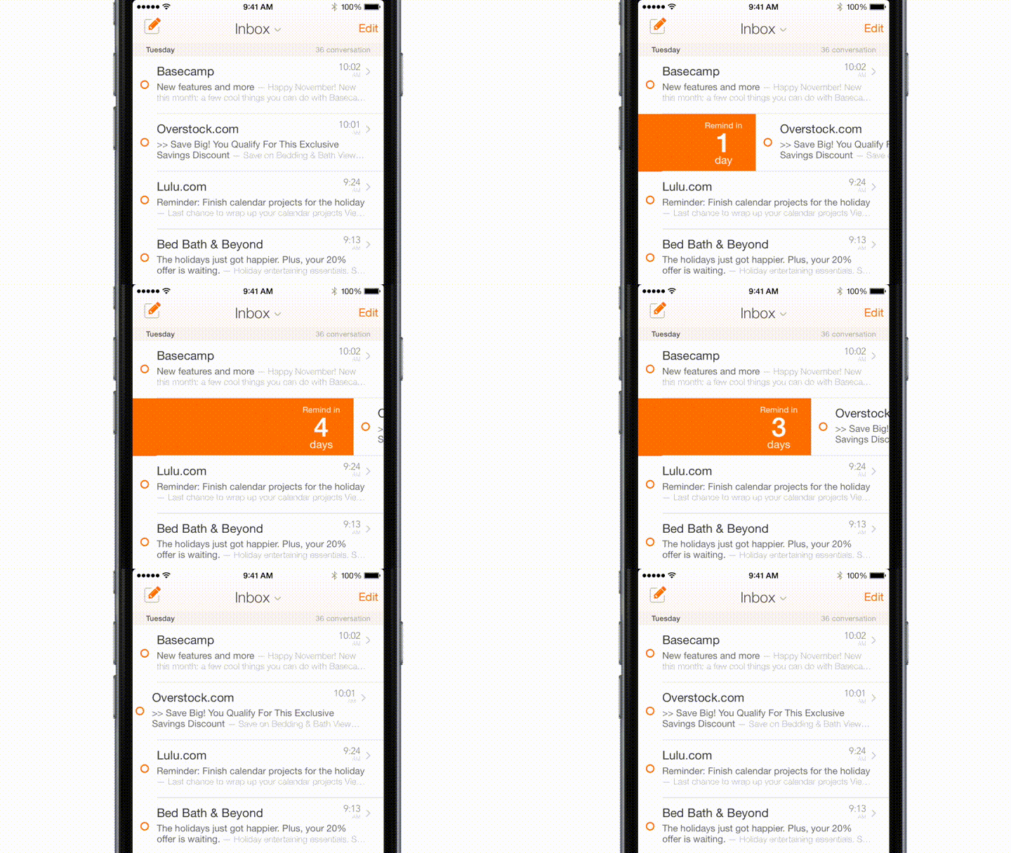
Eliminating superfluous taps to kill mundanity; one of the great examples of reducing the number of taps is a mail app where one can set a reminder for an email to come back in the future. Usually, it can take up to five interactions to do so but in this gif below we can see it has been reduces to just one swipe.
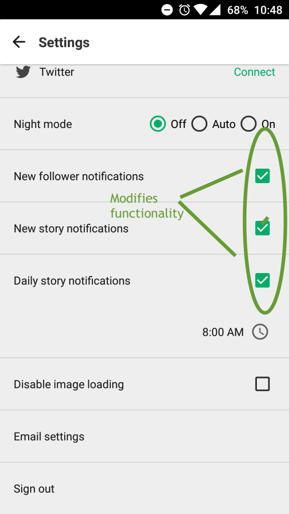
It is also important to use elements in accordance with the type of functions they are meant for. A switch button and checkbox may seem to have the same behaviour but they are used for very different tasks. A switch button has a notion of quick action, for e.g. toggle WiFi, however, a checkbox usually stitches the behaviour of a feature in an app, for e.g. toggling frequency of push notifications from a particular app.

Micro-interactions:
Micro-interactions help users to be able to approach the interface no matter how complicated the logic behind the scene may be. These interactions help the user know about what is happening and help visualise the outcome of actions.
An intuitive progress bar which is a delight to look at and at the same time keeps the user notified about the system status.
A card input interactions where the user can relate the numbers he is putting in with a real life credit card. A cumbersome experience of inputting numbers just became pleasant due to this nifty and relevant micro-interaction.
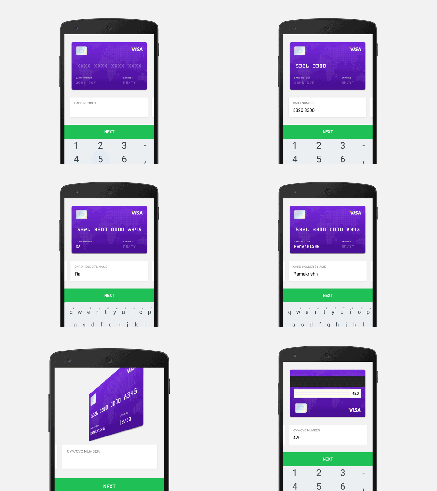
Source: Dribbble by Ramakrishna V
Visualise input; an example of a range date picker for a hotel booking app demonstrates the importance of visualising input from the user and providing instant feedback conveying more than just numbers.
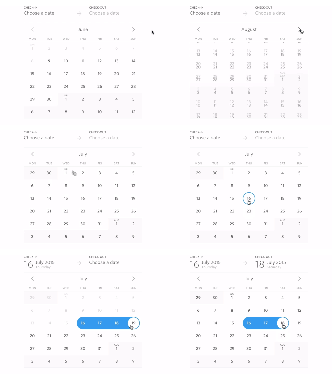
Source: Dribbble by Hernán Sartorio
[call_to_action color=”gray” button_icon=”download” button_icon_position=”left” button_text=”Download Now” button_url=”https://templatetoaster.com/download” button_color=”violet”]
Create stunning web designs just in few minutes using TemplateToaster web design software and website builder
[/call_to_action]
