UX Design: How Animation Ideas Drive Conversions on Payment Page
Motion design has been with us for years now and gives UX design an upper edge. But it is only recently that it has become so prevalent. And the hardware we have now can easily support them fluidly. Animations give life to static content and their behaviour represents real physics which humans perceive as second nature. We have meaningful animations on almost every aspect of an app or a website that are relevant, embellish content and produce delight to the users. We experience these animations on onboarding screens, landing pages, products page and even shopping carts but rarely do we experience them on payment page where conversions happen.
Why Using Moting on Payment Pages is the Best UX Design Function?
Following are some of the reasons for using motion design on the payment page can enhance UX and result in better conversions.
Motion Drives Confidence
Animations help in orienting the moments from one state to another. If a user clicks on a button he should immediately know by visual feedback that a button has been pressed. It also means something is about to happen, all in a subtle yet “non-missable” manner.
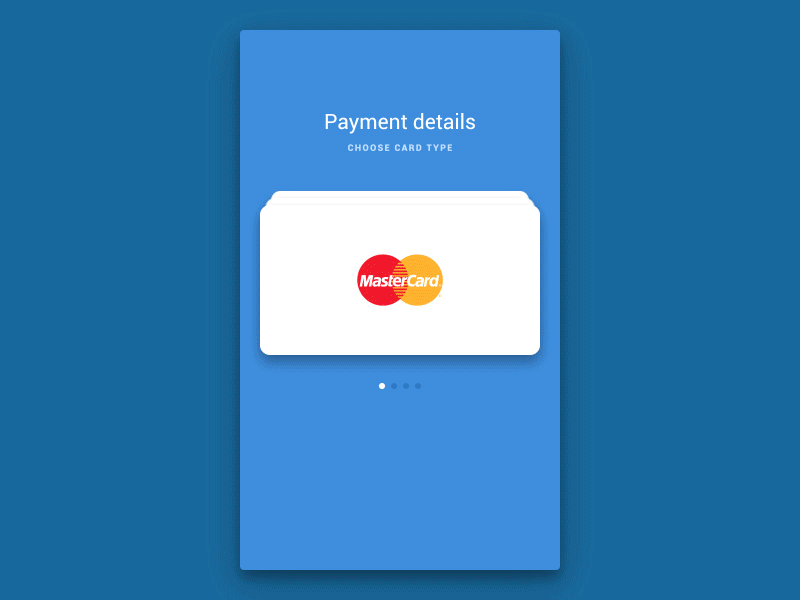
Source: Dribble.com
Arriving on the payment page usually to most people is a crucial step. Primarily because they want to be privy to their details and also feel secure about their information. After clicking on the “Pay” button their brain expects immediate feedback. “Right ticks” and “green colour” are perceived by our visual cortex as positive. Thus “hey, everything went well” builds confidence in users and adds to great UX.
However, also important for designers to keep in mind that not every place or moment in the checkout flow has to be animated. Sometimes, a user may get overwhelmed with a lot of motion which can minimise assertion from his end.
Motion Represents Functional Change
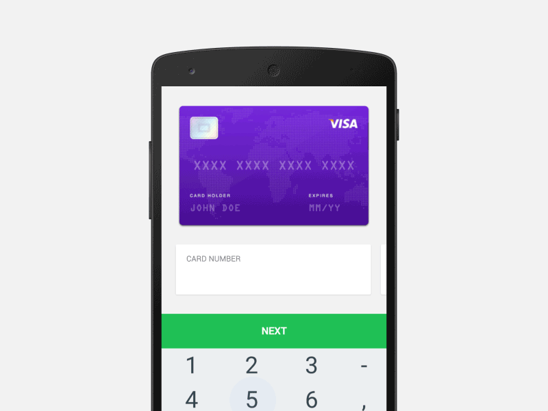
Source: Dribble.com
This checkout flow is a mix of flat and skeuomorphic design which imitates a real debit card and placements of the numbers. The user puts in are also similar to that on a real card. Notice how the card flips for the CVV number indicating the user exactly where to look for this number on his real card. The flip also represents that everything is fine for now and it is okay to proceed further. Furthermore, this gives a sense of assertion to the user.
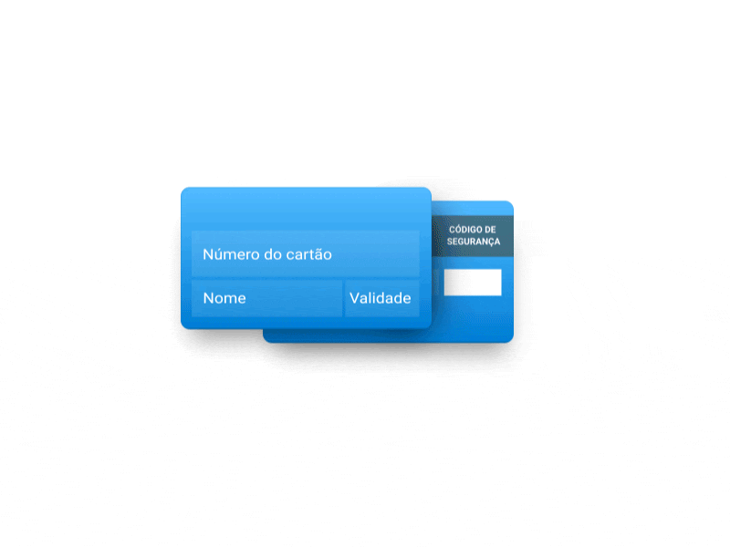
Source: Dribble.com
Another example of “Functional change” to user input on the payments page is the ability of the system to determine the type of card (Visa, Mastercard, etc) and express it visually. This visual feedback to user input puts them in confidence by just changing the logo and colour of the card. So from American Express to Visa (in the above example) when they enter the first four digits of their card number.
Animations Guide to “Highlights”
Animations are also used to guide the user’s attention to a section of the layout telling the user “hey, look, this might be important!”.
Example 1
On a payments page, sometimes, there must be an important message. Therefore, it is crucial for every cardholder, say, “some bank’s card won’t work here”. In this case, when the user lands on the payment page he must be guided to that message in a subtle way via animations. Using a continuous blip dot over the message field just below the navigation panel is a good way to improve crucial communication and keeping the user in the know at all times.
Example 2
(If something has gone wrong) If they have their “Caps on” while entering a password they should be notified while typing in the text field once. On a wrong submission, they should be prompted politely with an alert box before undertaking their second attempt.
Animating Progressive Disclosure keeps them from Scanning a lot of Content when they First Land
One of the best design patterns when it comes to filling forms is progressive disclosure. For instance, if a user has a saved card previously with the website and wishes to use it. Therefore, he will be shown just that and maybe one field where he can enter the CVV. However, if he chooses not to use that card and enter a different card’s details, a new form is disclosed letting him enter just that.
The visual feedback in the above checkout flow for progressive disclosure indicates to the user that checking in the checkbox resulted in some more data fields to fill in. The slow fade-in animation from the checkbox area gives the user a sense of relativity. In context between the action of checking the checkbox and the fields that appeared due to that.
Conclusion – Why UX Design is here to Up the Game?
When the state of the screen changes abruptly our brain gets a lot of aspects to process and we load our brain (CPU) with processing the content and the reason it happened. Animating these transitions from one screen state to another takes a lot of processing from our CPU to our visual cortex (consider it as the graphics card of our brain). And now when both GPU and CPU share the load, transitions become easier to process and content seems more relevant. This is why animations are not just for the sake of user delight but also for keeping the user in the know.
The UX Design is a must prospect to be worked on for Web Designers these days. This works better when you can visualize the Design while coding. Therefore for which TemplateToaster web design software is suitably the best product available in the market. Also, you can create beautiful and UX Design friendly themes through a few clicks on the go!
[call_to_action color=”gray” button_icon=”download” button_icon_position=”left” button_text=”Download Now” button_url=”https://templatetoaster.com/download” button_color=”violet”]
Best drag and drop interface to design stunning WordPress themes
[/call_to_action]
Is there any plugin for integrating payment system.