14 Web Design Trends That Will Dominate 2021
If you are designer then you understand creativity is just as important as staying up to date with the trend. Designers are experimenting everywhere on the various features for their website design including animations, illustrations, color combinations, shapes and more. In terms of eCommerce and online networking, creativity and changing trends are the only consistent. Staying up to date with the latest trends is beneficial in terms of keeping the website in flow with quality. In this entry, you will learn about the existing and upcoming web design trends that will dominate 2021.
Technology is ever evolving and in the current scenario, it changes faster than ever. Website design trends are the most dynamic element that changes more frequently than others. Therefore, it is important for the website owners and designers to be aware of the design trends to stay ahead of the curve. In this article, I am going to list 14 upcoming design trends that are going to dominate 2021. It is a golden opportunity to seek in insider information and update your website using these upcoming design trends to stay ahead of the trend-
List of the latest web design trends
First thing to keep in mind while designing a website is to grab the user’s attention and keep them engaged. In order to do that, the most important thing is to understand their perception and serve them what they are looking for in the first place. Here is a list of some trending and visually attractive websites-
Also, have a look at the graphic design software for beginners.
1. Neomorphism a new web design trend
Neomorphism is a design approach that incorporates renderings of familiar, outdated material into latest designs. Take remix music as an example where an artist picks up an old music, adds some latest beats, mixes it up and redistributes the music. This design has been gaining popularity lately and seems quite promising in the coming year.
Pros of Neomorphism
- Uniform and easily identifiable
- Heightens users’ connection to design
Cons of Neomorphism
- Less realistic
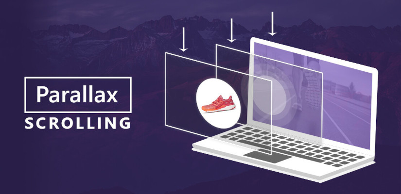
2. Parallax Scroll
In simpler words, parallax is an optical illustration that happens when objects near to the viewer appear to move faster than objects farther away, just like we see things in our daily lives. It creates a 3D view to offer a nice, subtle element of depth. Designers use this design to create a distinctive and memorable website.
Pros of Parallax Scroll-
- Offers sleek and heavy emphasis on design elements
- Bring life to any website when done right
- Use this design element to put any product under the spotlight
Cons of Parallax Scroll-
- Lack of SEO friendliness
- Not suitable for beginners with complex JavaScript coding
3. Smart Artificial Intelligent Chatbots

Artificial Intelligence is an emerging technology but is certainly not something new. Since AI and automation is being developed immensely, it has created more momentum for business, communities and financial systems. Same technology can be incorporated for fascinating smart AI chatbots to provide an excellent user experience. Web designs combined with AI advances can offer an interactive website. The latest advancements in technology are pushing boundaries, making it the latest ‘trend’.
4. Hero images with Big and Bold Fonts
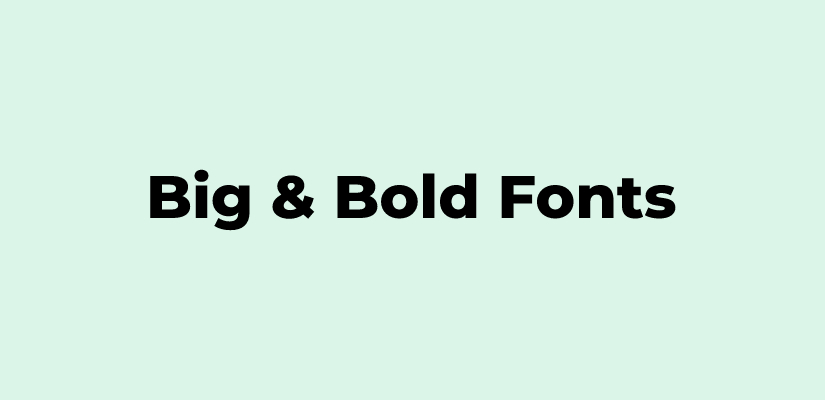
Hero images or area is a past of the website that is loaded first before other elements. It is usually a large banner image used on top of the website. Designers are now resurrecting the design styles along with the performance of the website. They are often used alone, beneath an overlay, under a text heading. You can expect to see more text-only trends that eliminates the typical background image and simply allows typography to do the work. However, it is going to have some personality on it rather than just standard sans-serif font.
Pros of Hero images with Big and Bold Fonts
- Focuses on the certain part of the website
- Improves the overall performance of the site
Cons of Hero images with Big and Bold Fonts
- Not as attractive as other listed web design trends
5. Minimal Designs with White Space
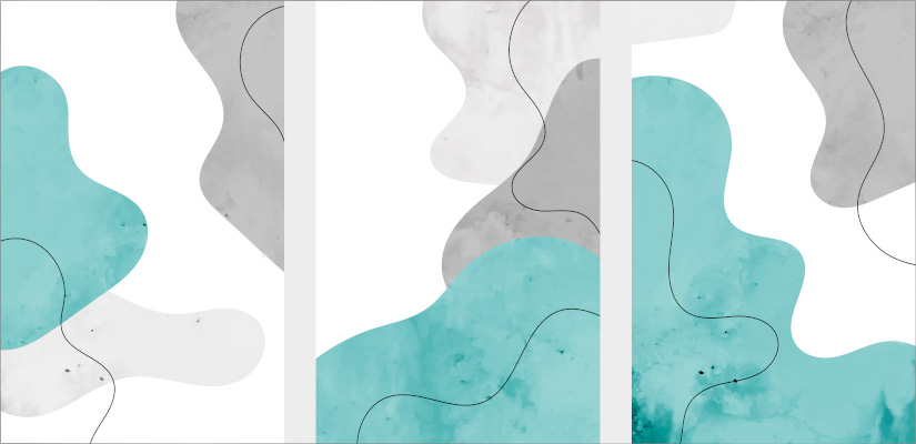
Minimal designs with white space is the latest web design trend looking promising in the upcoming year. Many brands are using minimal designs in their social media graphics, website design, and more. When designers don’t feel the need to complicate designs and want to offer a minimal but sophisticated visual communication, then minimal designs with white space is the best option. Moreover, minimal illustrations are often unique and creative that automatically offers more credibility than stock photos. With a minimal design, you can communicate meaning in less space than words.
Pros of minimal designs
- Powerful tools to communicate meaning visually
- Takes up less space than words
- Creative and credible
Cons of minimal designs
- Too simple, may fail to grab the attention of the users
6. Dark Mode
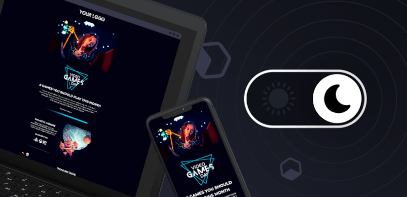
When you are striving for elegance, go for dark mode. Big brands like Apple are using this web trend to offer a sleek yet elegant touch to their website. For a long time, white background has been the default and was considered as the only way to create an empty space in a website or mobile application. However, designers began adding darker themes and elements lately. In 2020, all major platforms like Instagram, Twitter, Whatsapp, etc launched dark mode. Not only does it look elegant but it is also a treat for eyes. People spend hours scrolling through their social media pages and dark mode goes easy on the hours of scrolling.
Pros of Dark mode
- Easy on eyes as it reduces blue light exposure
- Offers a sleek and chic visual
- Less battery consumption
Cons of Dark mode
- Difficult to view in daylight
7. Hand Drawn Illustrations i.e. Cartoons
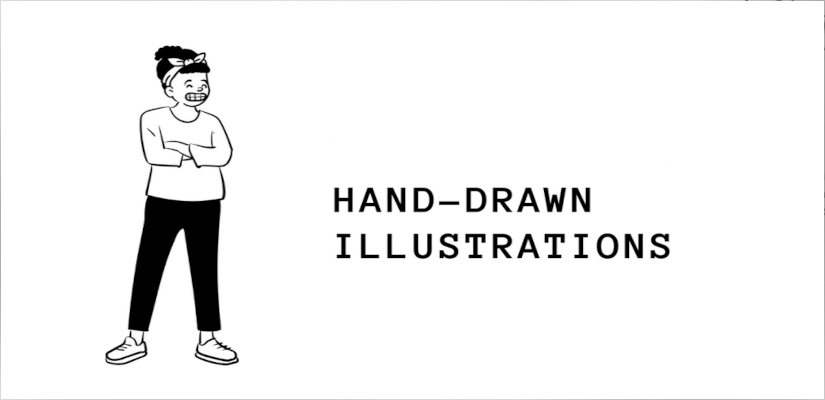
Hand drawn illustrations are the true art and absolutely revolutionized the graphic design industry over the past couple of years. A large number of brands, creators, and brands such as Gucci, or health insurance company AHM, etc, are catching on to the popularity of illustrations and cartoons into their website design. Hand drawn illustrations are great for adding an authentic yet creative look to your website or mobile apps. It offers a welcoming feel to your website visitors and adds credibility to the overall design of your website in a quirky way.
Pros of hand drawn illustrations
- Quirky and authentic design elements
- Focuses on diversity, individuality, and representation of your product/website
Cons of hand drawn illustrations
- May not fit in a formal website with a classic theme
8. Videos as Hero Images
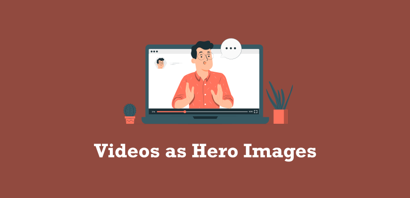
Video is a great way to create dynamic headers that attract and keep users engaged. Now, incorporating a video in the hero part of a website can create a tremendous impact on how users perceive and engage with your brand. According to a study by Forbes, embedding a background video can help you boost your conversion rates by 80% and influence a customer’s purchase decisions by 90%. Designers can demonstrate the product and allow visitors to visualize your product/services.
9. 3D Objects in design
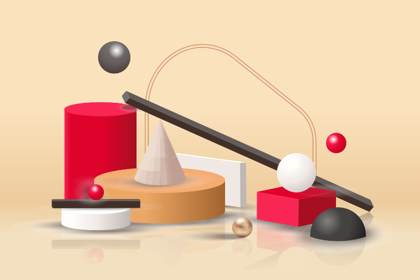
3D elements are anything but new. They have been in trend for years and will continue to be in trend in coming years. Especially now, when technologies like Virtual Reality and Augmented Reality got more grounds. Hyper Realistic 3D objects are the most engaging web design preferred by companies. It has the potential to increase user/customer engagement significantly. Moreover, 3D objects combined with AR/VR span the barriers between real and digital life, giving an overall unique experience.
Pros of 3D Objects in design
- Beautifies the overall experience of a website
- Spans the barriers between real and digital life
- Potentially increases the user engagement
Cons of 3D Objects in design
- Requires high performance mobile application or website to make significant 3D
Bonus Web design trends that will dominate 2021
Some other emerging web design trends that seems promising in 2021 are as listed below-
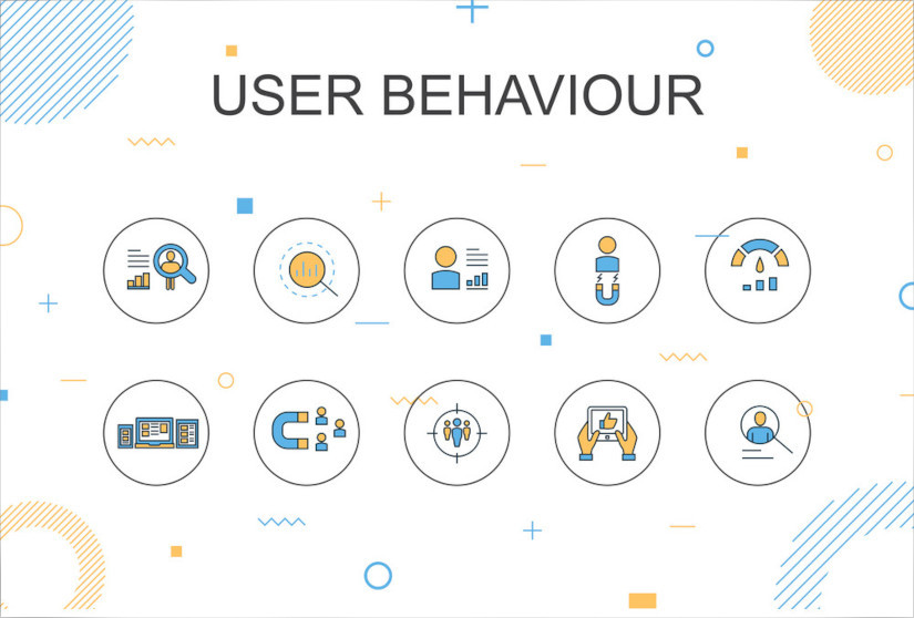
10 Visitor Profiling
Visitors profiling is a way of understanding your targeted audience. It can help you ensure engagement and maximize user experience. Designers are now using advanced tools for user profiling and designing the websites as per their targeted audiences’ taste. Moreover, user profiling can offer you a deeper understanding of your visitors. Indubitably, it is a great way to stay ahead of your competitors.
11. Heavy Use of CRMs
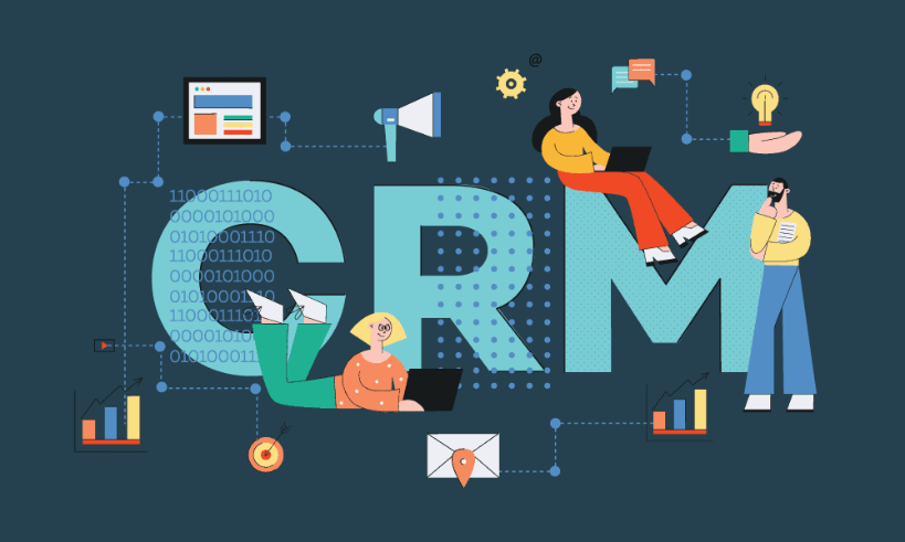
Using CRMs for online lead generation can be a great way to boost user engagement. Many websites are incorporating progressive lead nurturing forms with their CRM tools. It is basically a way of letting your users/customers communicate their requirements or feedback to you. It can be a feedback form or contact form that stores the information of your leads. This way, the CRM can recognize the lead when they come back to your website and offer them the best possible user experience.
12. Showing personalized content to visitors
Visitors including the potential customers have the shortest attention span. Therefore, websites need to utilize those precious seconds and give their visitors what they are looking for. Advanced websites are now showing personalized content to their visitors. Therefore, websites are now using cutting edge tools to display dynamic content, based on the user’s past behavior and demographics.
Existing Approaches that will dominate the web design trends of 2021
Here are some existing web approaches with the potential of staying in trend in the upcoming year-
13. One Page Websites
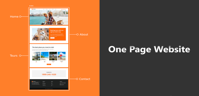
Long gone are the days when websites were cluttered with web pages within web pages. Now visitors are fond of simple and organized websites. Therefore, designers are preferring single page websites to ensure order, simplicity, and conciseness. Moreover, one page website offers a flawless and efficient user experience when executed correctly. Therefore, we expect this trend to continue in 2021 as well. Here is a comprehensive guide on how to create one page websites.
14. Lazy Loading
Lazy loading is an effective way of boosting the overall performance of a website. You might have experienced on some sites you scroll a placeholder image into the viewport and it is suddenly replaced by the final image when you reach that certain point of the website. Basically, it holds off the loading of the non-critical elements till they are scrolled into the viewport. It is certainly not a new trend but designers recently started taking it under consideration. We expect to see this trend growing in the upcoming year. Here is a guide on enabling lazy loading on your WordPress site.
15. Web Page Load Time Improvements
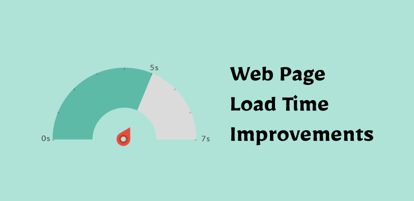
As we have mentioned before, potential customers and visitors have the shortest attention time. If you have a slow loading site then your visitors will abandon your site even before it will load. Therefore, you need to ensure that your website is optimized for faster loading. You can try minification of CSS to boost the overall speed of your site. Moreover, you can try optimizing your website images to enable fast loading of your site. There are various factors that can help you improve the overall load time of your site like using a CDN providers, best WordPress Hosting providers, and more.
Conclusion on Web design trends that will dominate 2021
So here are the trending web designs that are expected to dominate 2021. There are more web design trends involving typography, illustrations, animations, etc, than listed ones. Hopefully, these web trends will keep you up-to-date with the web design trends that are expected to dominate 2021. Use this exclusive list of upcoming design trends to stand out from the other websites with stale designs. Comment below to let us know your favorite web design trends!
Build a Stunning Website in Minutes with TemplateToaster Website Builder
Create Your Own Website Now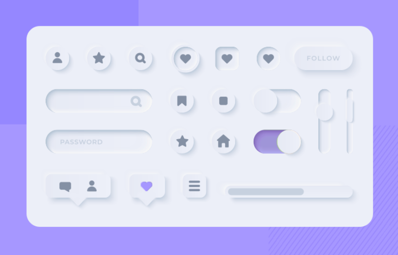
I use parallax scroll and has all the features.