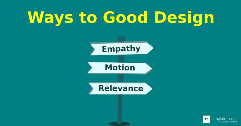
Motion design has been with us for years now but it is only recently that it has become so prevalent and the hardware we have now can easily support them fluidly. Animations give life to static content and their behaviour represents real physics which humans perceive as second nature. We have meaningful animations on almost every aspect of an app or a website that are relevant, embellish content and produce delight to the users. We experience these animations on onboarding screens, landing pages, products page and even shopping carts but rarely do we experience them on payment page where conversions happen.
A good designer always designs with the end user in mind, which we now usually term as user-centered design meaning designing with empathy. However, when we design for a broader range of audience, a number of variables need consideration such as gender, age, education, etc.
We are all too familiar with the challenges we face when we have to think of something from the scratch. Sure, we do sit down with a pen and paper but it is always hard to start penning what we visualise. Same is the case for UX/UI designers; they sure have the idea of an interaction but even they have a hard time sketching things down.
Even UXers with a proper wire flow in front of them faces emptiness when they start to sketch a web design or a mobile orientation for that matter.
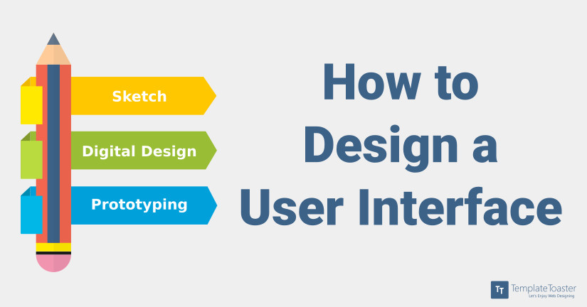
Now that you have decided to start a career in User Interface Design, you must be wondering where to start from. One of the biggest milestones in designing an interface is getting inspiration. After having thought of an idea it is time to sketch it up and convert what’s on paper into digital. This article will take you through all these steps and also suggest specific software to use for that “picture perfect design”.
When it comes to development it is very easy to be distracted from the actual development of a web application. Putting too much effort into attention to details sometimes leads to unnecessary time and energy consumption. The solution to the problem is custom CSS Libraries.
Incorporating flat design and material effects does make the UI look subtle, its easier on the eyes, the open spaces depict a wideness in thought, the colours aren’t flashy and, don’t come in the way and its a breeze to interact with. But, these are just some design elements which have predefined ways of implication like material UI has its own set of guidelines. It is important to understand that for a UI, the priority of its look and feel is secondary and is preceded by the relevance of context. Sure, these must go hand in hand but what use will these beautiful elements be of, if the interaction seems to deflect from logic.
