The Thought behind a thoughtful web design
We are all too familiar with the challenges we face when we have to think of something from the scratch. Sure, we do sit down with a pen and paper but it is always hard to start penning what we visualise. Same is the case for UX/UI designers; they sure have the idea of an interaction but even they have a hard time sketching things down.
Even UXers with a proper wire flow in front of them faces emptiness when they start to sketch a web design or a mobile orientation for that matter.
Here at Templatetoaster website design software, are a few tips that might help you pen what’s behind that thinking cap:
Get started
I like to start with a white board in front of me and a laptop on it with a plethora of inspirational tabs open which resemble the same context. After I successfully find some inspiration and a block idea for the start, I stare at the white board (which is hot now) and I start with the good old logo screen. I cannot begin to describe how helpful this is to get you started. It’s the rectangle with the logo which helps you get into that zone. The more you look at it the more you tap that thinking cap and the closer you are to sketch it.
Now that you have started to get a hold of it, it’s now time to use this zone and build a lot of sketches. Every time you think of refining a sketch just take a detour and think of it as a user. Take the whole journey and observe the number of taps required to reach a relevant checkpoint. You can ignore any emphasis on the colour palette, elements design or motion design. I mention this because as a UX designer these things come automatic but it is important to know how trivial they are at this stage.
Cherrypick and organise
Great, you have made it so far. It is now time for you to cherrypick the best interactions. I believe annotating your work is not such a bad idea even if the sketches don’t have to be presented to someone and also because human species never fails to forget. You can make a simple prototype via those sketched through phone apps such as Prott or Marvel which are available free on the play store.
Find them here:
Prott:
https://play.google.com/store/apps/details?id=com.prottapp.android&hl=en
Marvel:
https://play.google.com/store/apps/details?id=com.marvelapp&hl=en
Or,
if you think you weren’t legible enough for even these (which is fine by the way) you can just jump to making a low-fidelity wireframe.
The Lows build the Highs:
A low fidelity wireframe is a good place for you to think of a colour combination. Should the design be based on a specific colour palette, this is the right place to colour those elements and consider the contrasts.
This is also a good place to take a detour (again) and think like a rational user. I believe a UXer should empathise in three moods of a user and be very crucial about them:
The happy / curious user:
A happy user is someone who is just exploring with fewer expectations but might actually consider investing in some of the products or services, provided he is welcomed with delight. A simple delight can alter this user’s mood and if things fall into place you have a buyer.
Conclusion: Delight your user.
The user who hates beating around the bush:
This user I believe is like the bread and butter of minimal design. Interactions should make sense right from the first tap. Delightful animations here aren’t giving you many points. Simplicity, however, plays a bigger role with this kind of users.
Conclusion: Design less to design more.
That user who is really frustrated with something else you don’t want to know:
A user who wants either his job done or he’ll just uninstall the app itself. This user is a super exaggeration of the minimal design loving user only he means business and that’s it. You don’t want to bother this user with irrelevant dialogue boxes, notifications or unnecessary emails.
Conclusion: A good design is a good solution first.
The highs:
Well, the time has come. This step is like a concert for showcasing all your creativity, animations, drivers and effects you were procrastinating about when sketching. I use Sketch as my daily driver for building high-fidelity mockups and Principle for animating those Art-boards.
Elements show usability and if applied wisely they result in a good interaction design. Although, sometimes it is easy to get a little too carried away with some elements that its usability results in superfluous taps and not so fulfilling design.
Example:
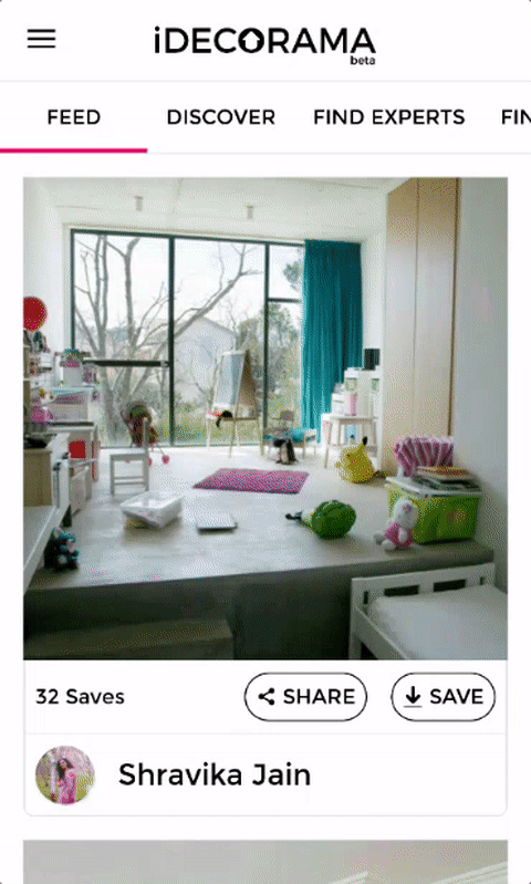
You notice how for every category there is a need to expand the panel and then select the items, which are taking much more space than they need to. An element like panel should be avoided in situations like these.
A better solution for an interaction like this would be:
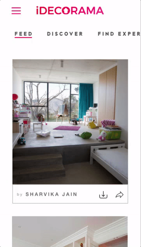
These oval links pop up on tap giving the user a sense of confidence in his selection. Items placed this way feel more interactive and take up lesser space which results in even lesser scrolling which you must have observed was too much in the former interaction.
Conclusion: It’s the little things that matter to make something big so delightful and useful.
In the end:
The purpose of going through all these steps is essentially a reduction in cost, time and effort. Let’s say, you jumped directly from the sketching stage to the high-fidelity wireframe, sure you will save a lot of effort initially but it would be a cumbersome job to make changes to a high-fidelity wireframe in an agile environment. So, don’t be lazy and start DESIGNING.
Related reading
[call_to_action color=”gray” button_icon=”download” button_icon_position=”left” button_text=”Download Now” button_url=”https://templatetoaster.com/download” button_color=”violet”]
Create stunning website designs using TemplateToaster
[/call_to_action]
I enjoyed where you mentioned all that about high fidelity wireframe, that it requires a neat, end-to-end complete planning and execution. Also how keeping the wireframes smaller to scroll will save the users time and also ours. It was a nice read. I just had my mind a little boggling while scanning through the content. Readability seems tough to me on your site. Eyes aren’t following my mind.
Great at making a website,very helpful tips.
Awesome article,very Informative content, Thanks for sharing