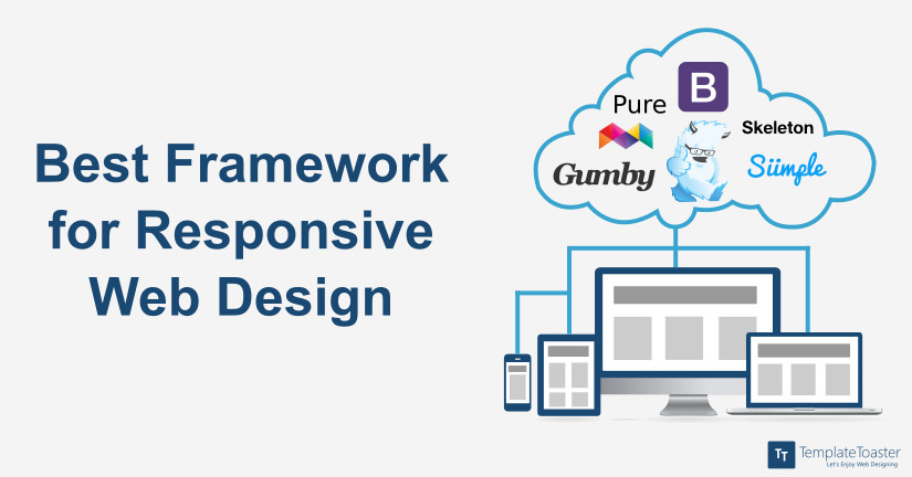
11 Best Responsive Web Design Frameworks
Responsive Web Design Frameworks are the must thing if you want to create a responsive website. Responsive web designing plays a huge role in user experience and website ranking. User experience is a crucial element of website design. So if you are someone who wants to create a stunning website, then knowing about the best responsive web design framework in 2023 can be of great help.
Having an effective online presence is the heart of a successful business. And with advancements in technology, most website users have shifted from desktop to mobile devices. And that designing responsive websites is more important than ever.
Responsive web designing refers to the web designing techniques that provide optimal web designing experience across all devices. In fact, there has already been a lot of buzz among web designers and developers about the ongoing practice of using responsive frameworks. These frameworks make it possible to create responsive web designs with built-in media queries and styles. Moreover, they are also effective in the development of user-centric applications.
Responsive frameworks include CSS and HTML5 tags and thus they are the best choice to create exceptional website designs. There are several best front-end frameworks available to use in order to create exceptional websites. Here is the list of my favorite Responsive Web Design Frameworks:
1. Bootstrap
Being one of the most popular front-end development frameworks, Bootstrap is now available with the latest Bootstrap 3 version. Bootstrap has got unmatched features, a structured grid system, navigational element and much more to this. Having such a framework at their disposal, developers can easily be built any kind of website without getting much technical . This framework is great to work with as it has got a start-up guide that new users can refer to while initiating the web development task. There is the option of creating fixed as well as fluid width layout. It has also got strong mobile support and thus a website having Bootstrap as its framework can easily be viewed on any mobile device. You can create Bootstrap website in minutes with TemplateToaster Bootstrap builder. You may read Bootstrap 3 vs Bootstrap 4 and Bootstrap vs Foundation. You can also consider using Bootstrap Dashboard Template to boost your development process with ease.
Main Highlights:
- Widely-used responsive web design framework.
- Popular choice HTML, CSS, and JavaScript framework.
- Good documentation to help you with responsive web designing.
- Great community support.
- Bootstrap 5 the latest version comes with extensive functionalities and great improvements.
2. Tailwind
Tailwind is also a widely used responsive web design framework. It is a utility-first Optimized CSS library that is popularly used in UI development. Notably, it gained popularity because of its rapid development. It provides single-purpose classes which can be used directly within the web page to style an element. So the developers can rapidly build user interfaces. Mostly Tailwind is used to create custom user interfaces, without having to write CSS.
Main Highlights:
- Speeds up the development process.
- Relatively small file size.
- Easily build and maintain a large codebase.
- Provides great accessibility features.
3. Bulma
Bulma is a free open-source powerful CSS framework that is widely used to create responsive websites. It is based on Saas and Flexbox and is usually referred to as one of the top frameworks for front-end development. Also it is highly customizable and a lightweight framework, compatible with most popular browsers. It comes with modular columns which make its development easy, predefined colour options, and sufficient designing options. Each component of Bulma is designed keeping vertical design in mind.
Main Highlights:
- Mobile-first framework.
- Highly customizable.
- Platform independent.
- Offers ready-to-use components.
- Based on Flexbox.
4. Semantic UI
As a framework, Semantic UI has gone popular within a few years. The fact that semantic design approach can be incorporated in other frameworks easily allows the use of third-party style guides. Semantic has got a number of elements including buttons, loaders, divers and collections such as forms and breadcrumbs and more. There are sophisticated modules that range from popups to dropdowns and to sticky bones. All these features make Semantic an extremely feature-rich framework to use for the web development requirements. This framework is easy to use and that is why one popular among the developers.
Main Highlights:
- The framework comes with defined components, the developers can only load the components they require.
- Semantic UI offer 3000+ themes and 50+ components.
5. Materialize
Last but not least, on our list of top responsive web design frameworks in 2023 we have Materialize. It is a leading Material-based CSS framework. One of the major reasons behind its popularity is that it provides a consistent look and feel, and enhances the overall experience. Also, it improves the animation experience too. Also, it provides many components like badges, scrollSpy, scrollFire, wave behaviours, and mobile-specific slide-out menus and toasts that are not usually present in other popular frontend frameworks.
Main Highlights:
- Offers standard 12-column responsive grid system.
- Easily design websites like Android apps with various built-in JavaScript effects.
- Easy HTML forms are compatible with all popular browsers.
- Different sizes and colour icons.
6. Foundation
Foundation is also counted among exceptional front-end frameworks. It is an ultra responsive framework that is used to create seamless designs to create websites, applications for the web and mobile and email templates. Foundation is the easiest framework to learn and thus it can easily be used by a new user. This exceptional framework has got a number of components including layouts, navigation, media, library containers and much more. Foundation has also got an exceptional list of plugins that offers extended choice to the developers to choose one accordingly.
Main Highlights:
- Comes with HTML and UI elements.
- Wide array of customization options.
- Includes templates, code snippets, as forms, buttons, navigation and more interface components.
7. Pure
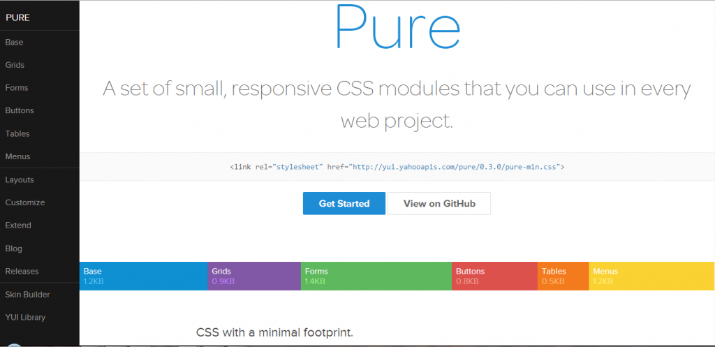
Pure is an overwhelming choice to use for accomplishing web projects. Being a small set of CSS modules, Pure has tiny footprints. This outstanding framework has been developing with mobile in mind and additionally including minimal style. This helps developers to write various styles on the application depending upon the requirement. An extensive range of CSS components has also been made available with Pure. This outstanding framework has also got an impressive customizer and thus developer has the choice of creating CSS framework of their choice and requirement.
Main Highlights:
- It has great built-in elements like base, grids, forms, tables, menus, and buttons.
- It is very lightweight i.e. just 4KB.
- Beginner-friendly, easy to use, and intuitive.
- No dependency on JavaScript and its library.
- It is a good alternative to Bootstrap
8. Skeleton
Although Skeleton is a small responsive framework design, it aids in the rapid web development of websites irrespective of their sizes. It has a lightweight 960 grid base that helps in creating websites for mobiles, desktops, tablets and other such devices without compromising on the quality. Additionally, it has got basic UI elements, foundation design, forms buttons, tabs, as well as organized file structure. All these elements contribute towards decreasing the web development time. Skeleton, with tons of other web development features, is a framework for the future. It is an exceptional framework to utilize in order to built aesthetically beautiful websites.
Main Highlights:
- Easily build responsive, mobile-first web page designs.
- Simple and lightweight.
- Easily set up the coding structure.
- Skeleton Boilerplate: PSD to HTML.
9. Siimple
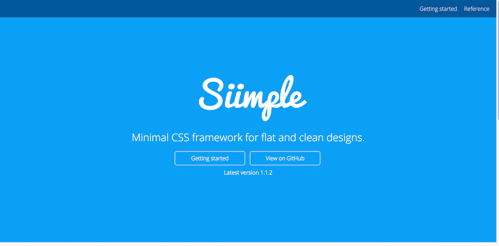
Flexible, aesthetically built and a concise front-end CSS framework to accomplish clean web pages. Siimple is beautiful and mostly used for building web pages that are flat and clean. Working on these simple things sometimes prove to be exceptionally well for the development of user-centric websites. This framework is certainly minimal having a few lines of codes that can also be zipped down to 6KB in total size. This framework is one suitable for newbies who are just starting with their website designing and require a framework to experiment freely. Siimple helps such developers to create minimal and clear web designs.
Main Highlights:
- Open-source CSS toolkit for responsive designing.
- Easily customize colors, fonts, icons, shadows, and more.
- Beginner-friendly, easy to use.
10. Gumby
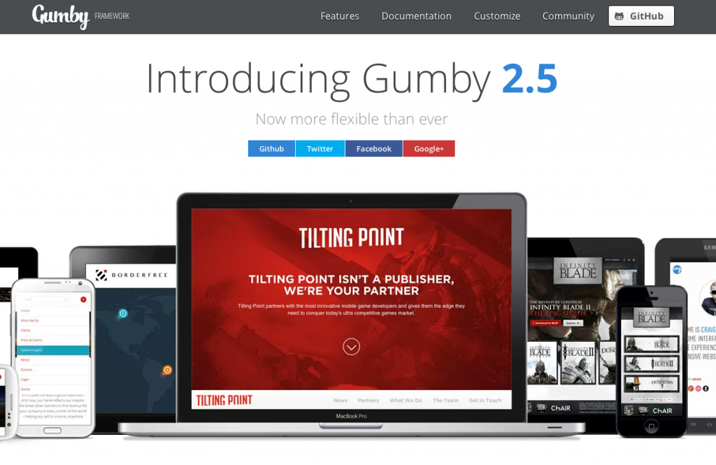
Gumby has got a plethora of features including flexible grid, toggles, and switches responsive images, well defined UI kit, fancy tiles that make it one of the best flexible responsive CSS frameworks. All these features make it an outstanding framework to consider for your web development requirements. It has also got the goodness of SASS that aids in speeding up the Gumby development. This outstanding framework has also got powerful customizer with the use of which it gets easy to create your own grid system, typography and a lot more to this.
Main Highlights:
- Free and open-source SaaS based CSS framework.
- Amazing features like flexible grid, toggles, well-defined UI, and more.
- Create custom grids with typographical system.
11. Tachyons
If you are looking for different web designs then Tachyons is a good option for you. It is a utility based CSS library, but you do not need to write a lot o CSS library yourself. Tachyons offers many styles so you can quickly create responsive web designs. Also it is lightweight and does not require additional setup. So, if you need a simple utility library then Tachyons is a good option.
Main Highlights:
- It is a utility based CSS library.
- You do not have to write a lot of CSS.
- It is a lightweight app so you do not require additional set up.
Conclusion : Choose the Best Responsive Web Design Framework
A responsive web design framework is a crucial aspect of creating a website. So you need to pay extra attention to choosing the best web design framework. Since frameworks are the basic elements that are required to accomplish website development. Right from having HTML5 goodness to the basic cascade styles, all the frameworks that have been listed above are great to be utilized for initiating web development. Moreover, before choosing any of the frameworks make sure to opt for the one that suits perfectly to your project’s requirements.
Although Bootstrap, Tailwind and Bulma are our top 3 responsive web design frameworks, all of the above-mentioned frameworks are good in their own way. So you can choose based on your preferences and web project requirements.
Build a Stunning Website in Minutes with TemplateToaster Website Builder
Create Your Own Website Now
I’ve built a theme based on Foundation CSS. You may want to check it. However I like foundation over bootstrap because they were fist who implemented flexbox CSS.
Great list guys! Responsive design frameworks are really important for building websites today and I totally share your opinion that Bootstrap and Foundation are the most popular ones.
As Nick Pettit from Team TreeHouse pointed out, choosing between Bootstrap and Foundation is like choosing between red or white wine 🙂
Does TemplateToaster use any one of these frameworks?
I really like Skeleton, it provides just enough to kickstart your project. I would like to try Siimple too.
The other frameworks like bootstrap and foundation seem too much, in my opinion. Why would you want tons and tons of features prebuilt, do you want your site to look like everybody else’s? Yes, they are perfectly built, but I probably wouldn’t use half of the features.
http://bulma.io should be in this list. No js, and build with sass. Simple to use and customize…
Gumby Framework has been gone since before this article was even posted.
Good effort.
This article doesn’t seem to suggest why a given framework would be useful. No critical evaluation. Not much effort here… just a filler article?
This article doesn’t seem to suggest why a given framework would be useful. it didn’t suggest how each framework helps a site be responsive more easily. Overall it wasn’t very helpful to me.
So is this a list of the “Best Responsive Web Design Frameworks” or “most renowned frameworks used popularly”? Those are not the same thing.
People should also check out UIkit.
Best one 1 for all time 😉
“getuikit”
Thank you for sharing this collection of frameworks, it’s interesting. Responsive design is truly important nowadays as it engages and entertain customers. As a result, it boosts traffic.
Thanks for sharing the great information.
Great list guys! I also used Bootstrap and Foundation. These are best frameworks.
Nice Collection of Designing Platform
Thanks for your great suggestion here.
Thank you for the write up, this is a great overview of all of these frameworks. Because as we know Frameworks are designed to get you up and running with a functional fast and easy.
Nice Information! This list of framework is very helpful to create the responsive design of website. If anyone want to design the responsive website then you can use any framework which is given in the list. Nowadays, Website should be responsive is very necessary according to SEO Purpose also.
Thank you sharing nice information about best frame work for responsive webdesign
Spectre.css is excellent. https://picturepan2.github.io/spectre/
Great approach to help the entrepreneurs and rising businesses.
Good.
Thanks for sharing responsive design frameworks with us.
Greetings .
The article seems to be well written and to the point and very easy to understand.
Thank you!
What a fantastic post. This is so useful information. We are specialized in React Native App Development.
Thanks for sharing such a great, very informative and useful article on Responsive Web Design
Great piece of information.
Thank you for sharing such a nice information about best frame work.
Thanks for sharing information…
Thanks for sharing Responsive Web Design Frameworks with us!
Thank you so much for sharing this wonderful blog. It’s really so attractive and i have learned best responsive web design frameworks.
Keep it up.
Thanks for sharing such an informative and helpful blog
Best framework list it helps lot to both website designers beginners and experienced to try various responsive website making frameworks to select best ones. I think Bootstrap is one of the most popular website designing framework for responsive website development.
Thanks for sharing this wonderful information. You can have a look at our design also.
Good article about User Interface Frameworks.
Thanks for sharing this list.
Thanks for such nice information which will help in web development
Bootflat is also good.
I love uikit CSS Framework
You should also cover the Admin Dashboard Templates availability of various Responsive Web Design Frameworks.