How to Create an Ebook Landing Page : Tutorial for Beginners
Do you want to create an ebook landing page to generate leads? Do you want your ebook to get downloaded from its landing pages? Don’t you want to miss an opportunity to convince your customers?…Then, read this tutorial for beginners on How to create an Ebook Landing page. This attractive Ebook landing page can maximize the downloads and conversions for your ebook.
A landing page can be any page other than a home page where a user lands after clicking a PPC ad or a search engine result link. An ebook landing page is designed especially for marketing & advertising. A recent study shows that ebook sales will account for a quarter (20 billion US dollars) of global book sales by 2018. So, the publishers and authors can target this potential ebook market by creating effective ebook landing pages. The ebook landing pages will capture the leads in an incredibly flexible way. They will work as lead generation tools to serve the purpose of downloading the ebook.
Purpose of Landing Page
A landing page not only generates leads but helps you in many ways. It increases the marketing opportunities and control effectiveness of your offers. As it allows quick and easy page content management without updating your site. It helps you to match the page content to your advert, reinforces the visitors’ mission so that they can take action to move towards their goal.
All in all, a landing page regardless of its purpose, give visitors exactly what they are looking for immediately upon entering your site. It can be estimated by the fact that 80% of all web traffic goes to the top 10% of landing pages.
Best Practices to Create an Ebook Landing Page Design
Your goal is to persuade a visitor to take an action. This action can be to sign up, subscribe, download, or buy etc. So, you need some basic practices to create an Ebook landing page to boost the conversion rates. Some of the best web design practices are as follows
- Right headline
A headline is crucial to your ebook landing page. An eye-catching headline will hook your audience. You should use bold section headings throughout the page to explain the benefits. It should not be descriptive but clearly, convey the purpose of your page and should justify the reason for click whether on Facebook Ad, Google Ad, a link from a blog article etc. Should help visitors to decide whether to continue reading or not. It should be logical, appealing and easy to skim.
- Subheading
Break the information into some small, digestible segments with one consistent topic discussed in each. Each such segment will be explained under a suitable subheading. Basically, it will give details to visitors about what’s included in the ebook and how it will benefit them. It should support the headline of your ebook and should be clear and convincing to persuade the visitor to read more.
- Ebook Description
After creating a right headline and suitable subheadings, you will do the groundwork with ebook description. Here you will explain the reason to write this ebook and why your visitor needs to download it. You will give the glimpse of your ebook here. Show value in your content and highlight the topics covered. It is like ebook synopsis that describes SEO and personalizes it in your business name. Keep it brief.
- List of Benefits
A benefit list is used to break down the information into easy to scan points. It is linked to ebook description. It tells the main benefits to a visitor rather than features. Also, explains why this ebook is the solution that they are looking for. The highlighted benefits are great to grab the reader’s attention.
- Ebook Landing Page Image/Video
People grasp the visual content easily and quickly. So, use a strong memorable core image on your landing page. Including an image/video will be really delightful to showcase the features you offer. It should be clean and relaxed. For example, an ebook by a resort can take the image of a beach or ocean. It will bring the imagination out of visitors to relax down at a peaceful destination.
Similarly, you can use a video to demonstrate the main content of your ebook with infographics, research or expert advice. An article reveals that a video can boost the conversion rate up to 86%. You can use it to showcase the features and benefits of reading this ebook. Make them aware that they have a lot more to read. A good-quality image/video will be really impactful to galvanize conversions.
- Lead Capture Form
The lead-capture form is a key element to create an ebook landing page. Here, you will collect the information from visitors and get benefit from these leads. The design of this lead capture form will decide your ebook download rate. It should be semi-extensive and easy to fill out. Keep only 3-4 fields or if possible email only. You should ask as less as possible.
- Call-to-Action (CTA)
The CTA (Call-to-action) is the most compelling component of your ebook landing page. It’s the action you want visitors to take. Try to put the CTA button above the fold. Use the appropriate text for CTA button. Don’t use “submit” or “click here”. For example, “Download Now” is more actionable as depicts that you will immediately get the copy of Ebook in your mail inbox. It should be attention-grabbing. Make your CTA button large enough and text bold.
- Adding Social Proof
Social proof assures a visitor that the ebook is worthy to read. You can do it by telling the number of downloads or social media likes/shares. An odd number values more. A live tickling number will be more attractive than a static one.
Additional Tips to Create an Ebook landing page
Now, you are well-aware of the best practices to optimize your ebook landing page. These will improve the download and conversion rates. But, there are few more things you should take into account as follows
- Focused Goal
You should have a single focused goal to get your ebook download. Insist your visitors to take the single action and remove any other navigation. Even, if it is a link to a website. Don’t ask anything irrelevant and remove all the distractions.
- Responsive Design
Many of the internet users make use of mobiles and tablets rather than laptops. A study shows that mobiles accounted for 49.74 % of web page views all over the world. So, your ebook landing page should be fully-responsive to fit all screen sizes. It should adjust automatically on mobile devices and tablets.
- SEO Optimized
You should fully utilize your SEO knowledge to design an ebook landing page. It should rank and index well in search results.
- Speed Optimized
A visitor never waits for a slow loading page. So, your ebook landing page should be speed optimized. It will be responsible for a better user experience and your website will also run smoothly.
- Testimonials
If possible, you can also link a testimonial from a real reader of your ebook. It will be great as a social proof. It will convey the value and credibility of your ebook. Be honest to quote a source name, picture, and company name.
- A/B testing
It is possible to miss something even if you have optimized your page. Here, comes the A/B testing. It is important to check different aspects of the page to see what is doing well and what’s lacking. It is great to check how well your page is performing and what is its conversion rate. You should use it regularly.
What not to do on your Ebook Landing Page?
Try to learn from others’ mistakes. You can see the common mistakes on most of the landing pages. So, here you will get to know about the elements not to be used on an ebook landing page which are as follows
- Never use a descriptive, bland heading. A headline is of no use if it doesn’t inspire action. It should speak the benefits. It should be clear not a mess highlighting too many features.
- Don’t use rounded numbers for social proofs. It shouldn’t be generic. Use a script that automatically updates the number of downloads. Isn’t it more convincing if this number changes as you are still reading?
- You should be clear about your offers. Use relative subheads. It will help visitors to understand what they are signing up for. It will increase conversion rate.
- Don’t use an outdated page design. Never hide your footer links. Use the appropriate heading size and well-designed elements. This is the first thing that can impress your future customers. Be more specific while choosing an ebook landing page design.
- Try not to use a long form. It will make your page look clumsy. Cut down the number of fields. Only ask you need upfront. You should use a well-structured form that also looks great.
- Never use the ebook name as the headline. Simply focus on what it will do.
- Don’t use a navigation bar as it is. Limit it to remove any distractions.
How to Build an Ebook Landing Page?
Now, you have enough knowledge about what to do and what not to while designing an ebook landing page. It’s the time to bring some real action by start designing. Firstly, you will see the basic elements to create an Ebook landing page ebook to include. Then, you will get a step by step guide to designing an ebook landing page.
Basic Elements to create an Ebook Landing Page
- Introduction Section
It is the primary section where you will give a brief introduction of your ebook and also displays a cover and call to action elements.
- Features and Video Section
Here, you will highlight the features of your ebook. You can also make use of a video demonstration that will act as a preview of your ebook.
- Featured Testimonial
This section is used to convey the value and build trust among the customers. You will display a client feedback testimonial.
- Chapter Section
Give a brief description of each chapter in this section. Try to display what is the content of our ebook.
- Pricing Tables
If you want to sell other products, you can make use of pricing tables to throw the deals. For example, Ebook+Product1.
- “As Seen On” Section
Use this section to maintain the trust of potential users. You will also include the companies logo you have worked with.
- About the Author Section
This section is to mention details about the author of an ebook.
- Call to Action Section
It is a must-have for a good ebook landing page. You will use a call to action element at the bottom of the page.
Procedure to Design an Ebook Landing Page
Although you can get a number of ebook landing page templates, those involve a steep learning curve. To get a quick ebook landing page design, you can rely on TemplateToaster website builder. So, let’s see the procedure to create an ebook landing page example with TemplateToaster web design software.
Let’s start to create an Ebook landing page
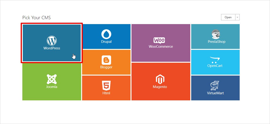
The first screen you will get after successfully installing the TemplateToaster is shown below. From here, you will make a CMS selection. You can start designing with WordPress.
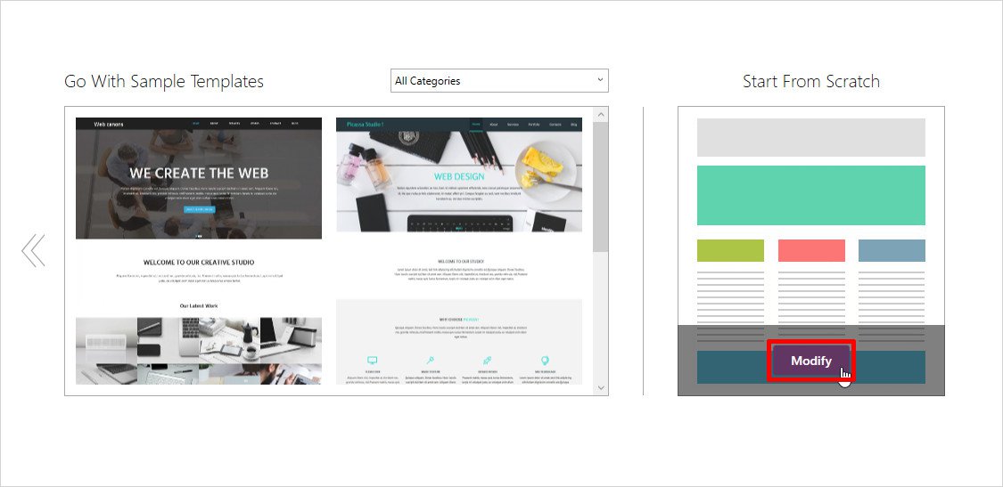
Then, it will ask you to select a sample page template or choose to design from scratch. You will click “Modify” on Start From Scratch screen.
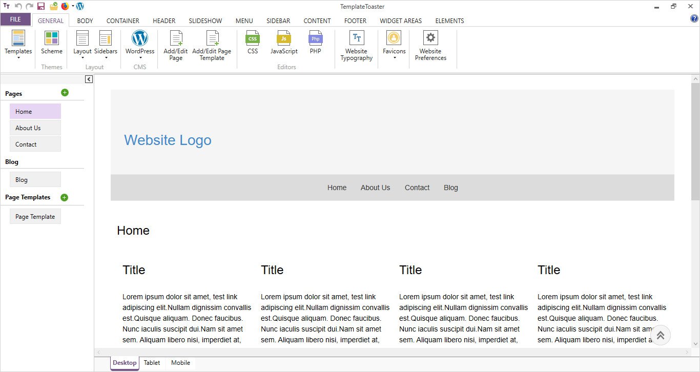
Next screen is the main interface of software where you will get a hundred of design options. These are well-organized under various tabs on top.
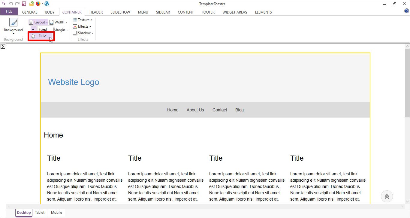
Next, go to Container tab and select a layout for the content part of your page. Here, it is Fluid. Also set its width, margin, padding, texture etc. from available options.
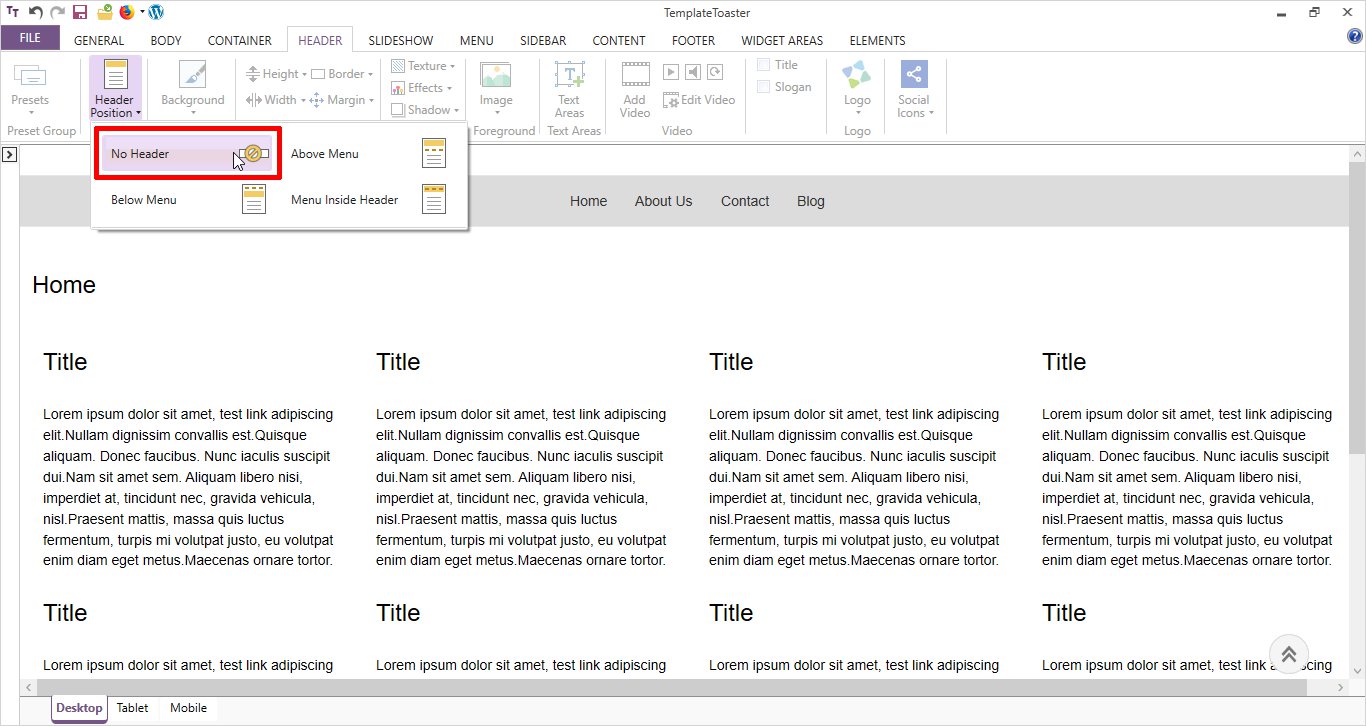
From Header tab, go to Header Position option and select no header.
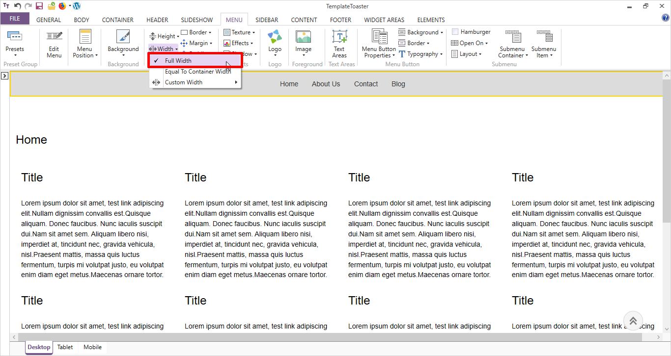
Next, move to Menu tab. Select Width → Full Width for your menu as shown below
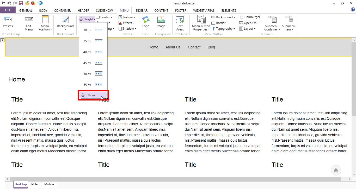
Now, set the Height. You can also specify a custom height by selecting More option. You can customize your menu according to your taste by using available options. For example, use Background to set a menu background color. Set a padding, border, margin etc. You can also set the typography (i.e styling of text) for menu buttons.
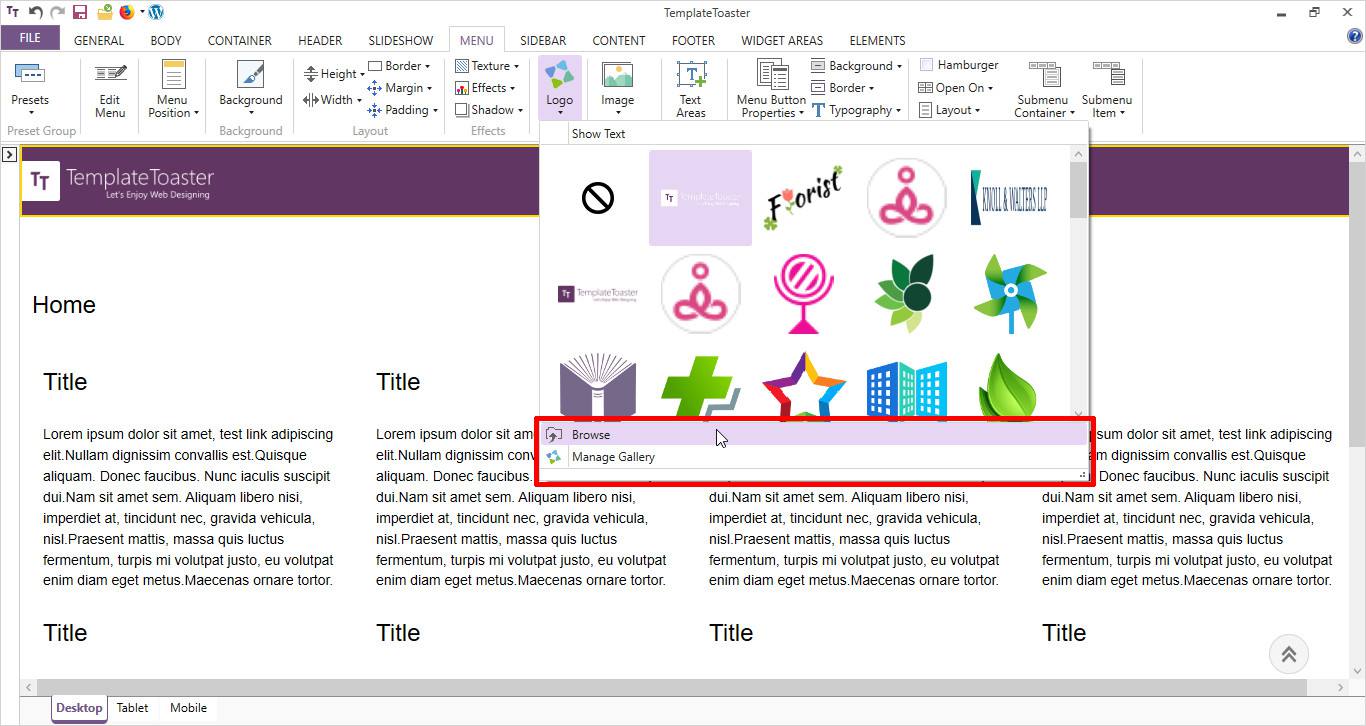
Then comes setting a Logo. For the logo, you can select an image from sample image gallery or browse your own custom logo image by Browse option.
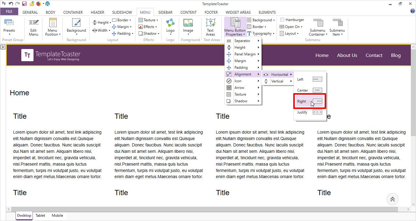
Now, set the alignment of menu buttons by navigating to Menu Button Properties → Alignment → Right.
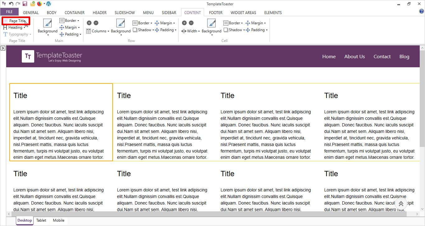
Now start designing the Content part by moving to Content tab. First of all, disable the Page Title by unchecking its box.
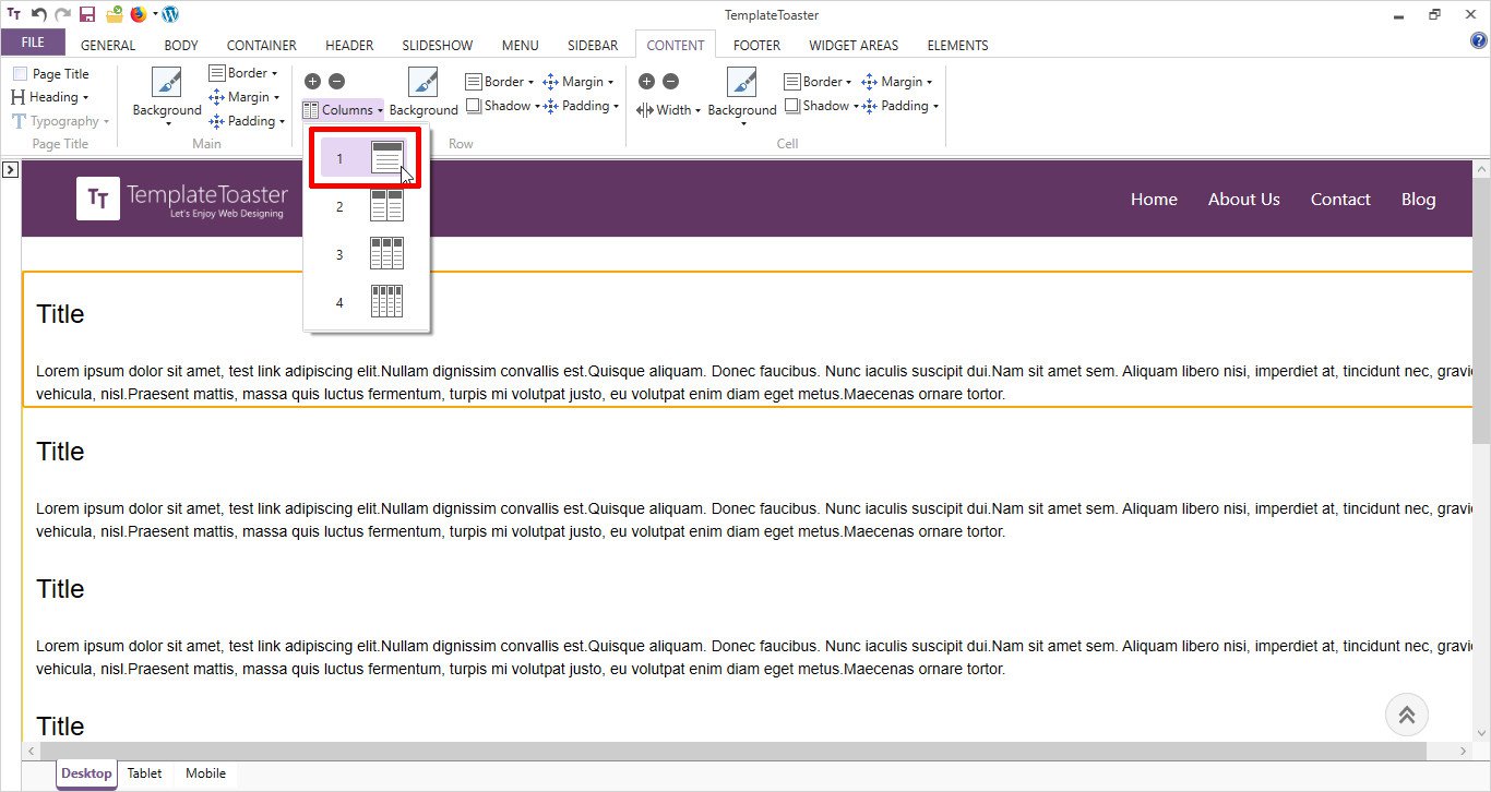
From Columns, select a single-column layout for the first row as shown below
Write a suitable Headline and just double click on the headline. It will open an Editor tab. From here, place the text in the center of the screen as shown below
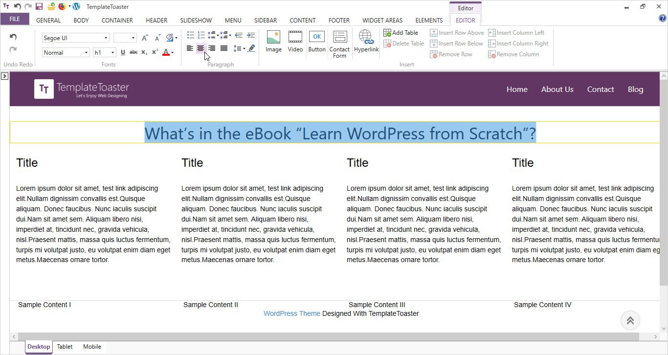
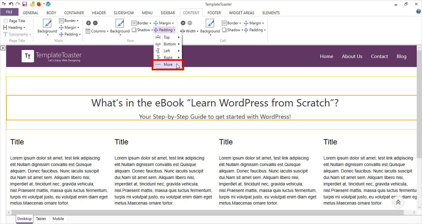
Now, set the padding, margin, border etc. as shown from Content tab options. It will complete your introduction section of Ebook landing page.
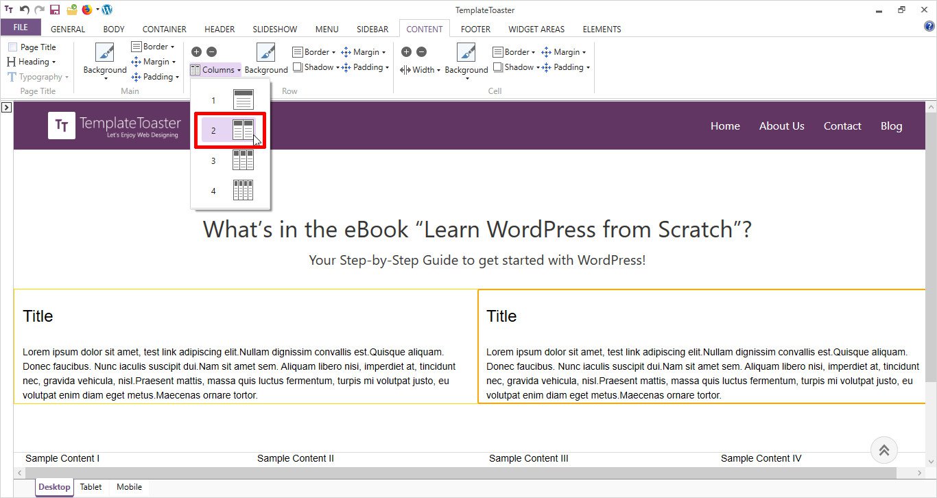
Select a 2-column layout from Columns option for the second row of the content.
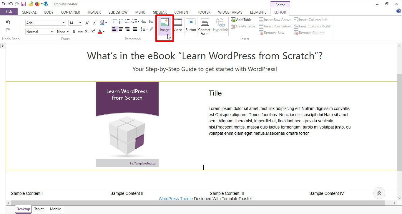
Place the cover image of the ebook in the first column from Editor Tab→ Image option. Double click on the text section of content to open the Editor tab.
Design the second column of content. Write the text and style it in your own way. To place a Button, move to Elements tab as shown above. You can also select any other element from the available options on Elements tab. For example, label, input, breadcrumb, link etc.
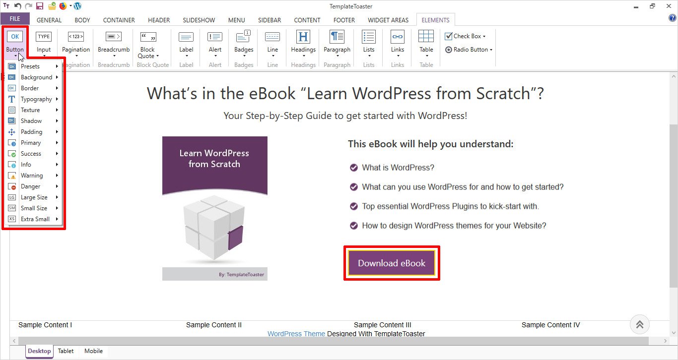
You can add more content rows from the + option of Content tab. Similarly, more columns from the + option of Cell category. It will give shape to your Feature section.
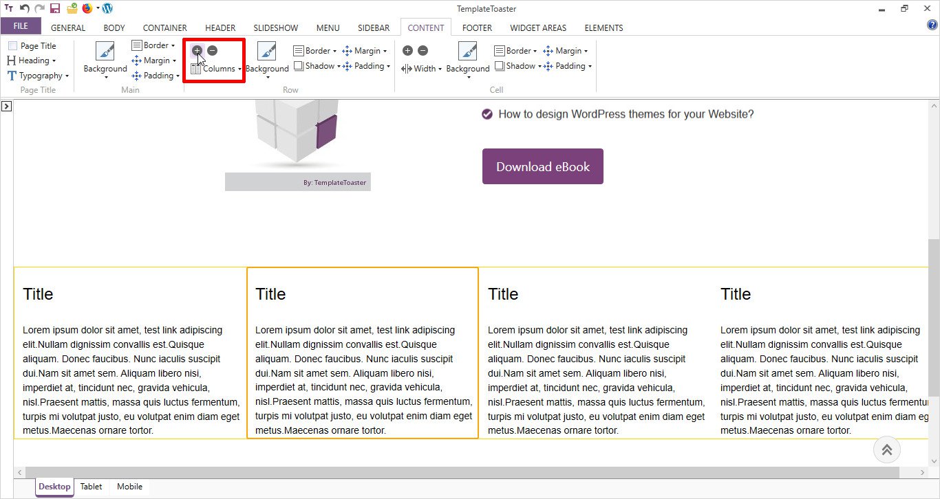
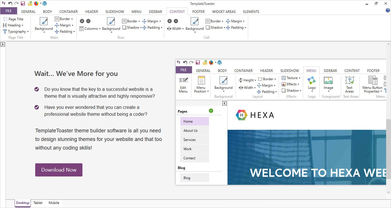
Similarly, you will add more text to the content area as shown below. For example, a row to add testimonials, Chapter description section & much more.
Finally, you will design the footer part. Set a background color as shown
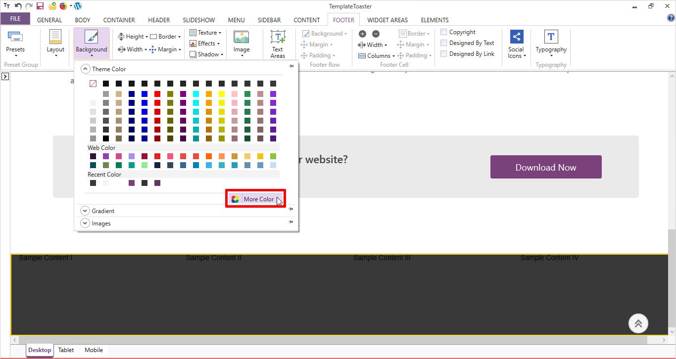
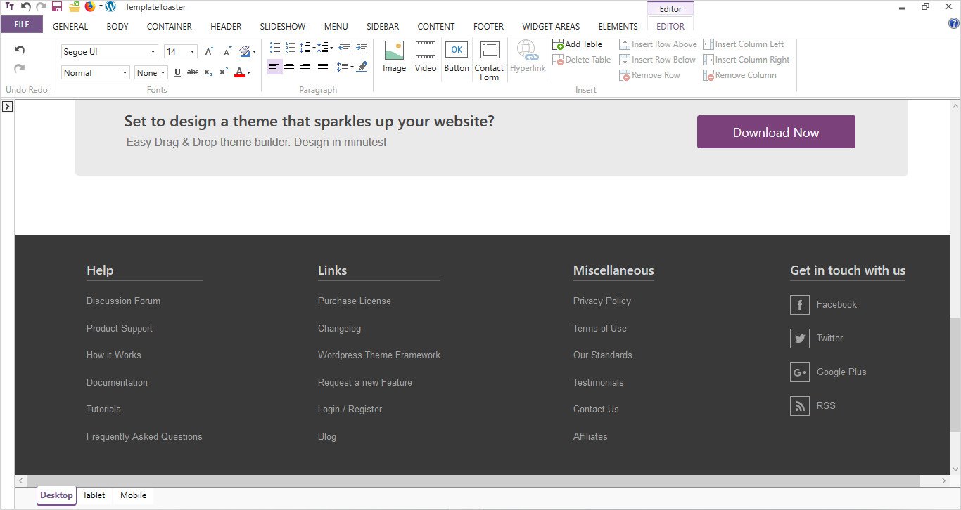
Add the relevant content by following the same procedure of adding columns in the content area. Use the Editor tab for styling the text and adding links.
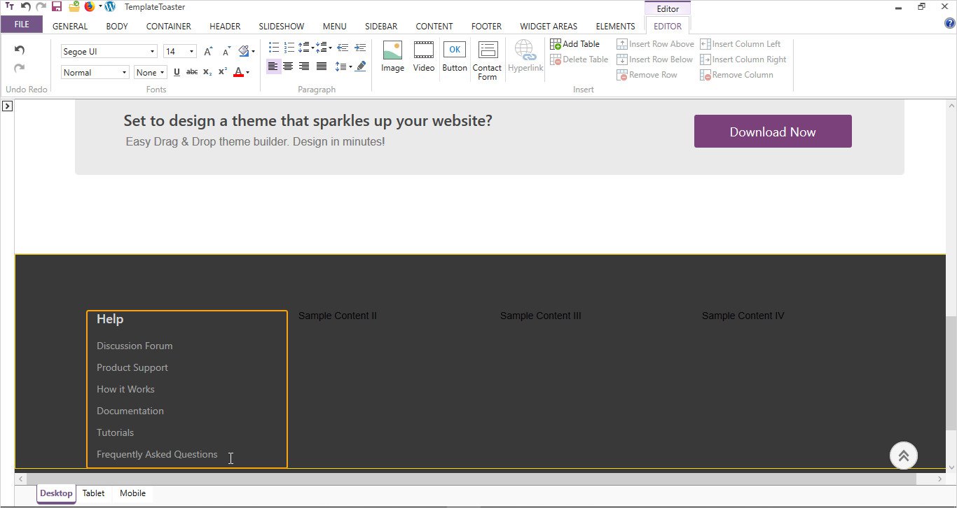
Your ebook landing page footer section will look somewhat like this
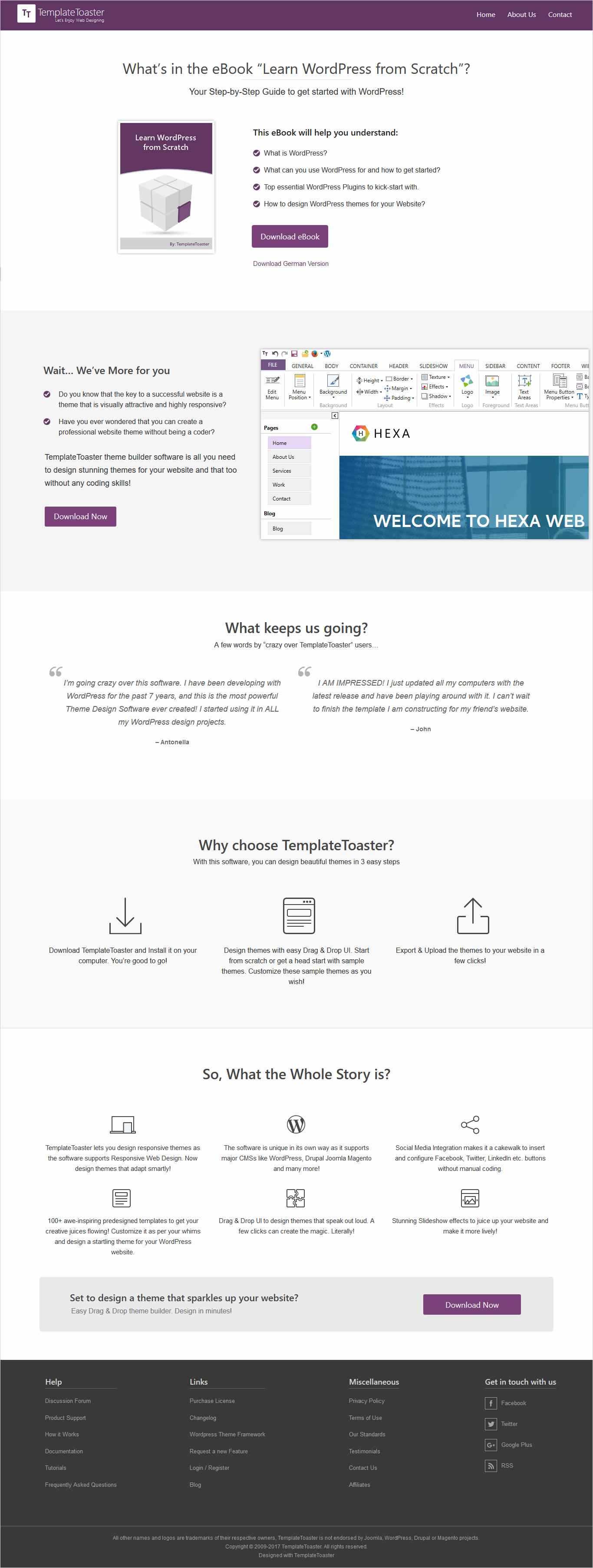
You are ready for your own Ebook landing page design. Just like that !!
Which method you use to create an Ebook landing page?
People are used to judging the book by its cover. The same way an ebook landing page is the face of your ebook. Through this, you will convince the visitors to download the book in exchange for sharing some information. This information will generate leads for your business. Even, a valuable ebook is a total waste without a beautifully designed ebook landing page. When you have all the required stuff – tips, design, procedure etc., create an ebook landing page today!! Offer your business prospects effectively on it and become an established industry authority.
Build a Stunning Website in Minutes with TemplateToaster Website Builder
Create Your Own Website Now
This is the best article to beginners to know about landing page, thanks for porting.
Heading can attract or distract to the audience, that should be good or unique so that people get interest in it.
Amazing article I have ever read regarding all elements of landing page. I love this.
Will it be good if we mention little bit in description and rest the things will mention in video?
This is really a wonderful article, I was looking for this article from very long time.
Every step has mentioned very clearly, I came to know about all step to prepare the best landing page, Thanks for posting.
How to sell the ebook?