8 Types of Modern Navigation Menus for Websites
There are various modern navigation menus available that you can use for your website. But deciding which solution can give you the best results can be intimidating. So, in this guide, I will show you some of the leading modern navigation menus that you can use on your website. They will help you make a good impression on your audience. So, without any further stay, let’s quickly dive in!
The ease of navigation is one of the essential factors to improve usability. Impressive yet easy-to-use navigation on a website can certainly improve user experience. So, you should have some attractive navigation menus for your website too. However, today due to the advanced use of the internet there are various speculations about navigation menus. But, navigation is the basic key element involved in the UI.
Indeed, it is difficult to even imagine making a website that doesn’t have a navigation menu included. Navigation is more like providing a clear plan of action to your users. However, there always exists a cluster of links located somewhere on the web page. If they are managed properly, they can help you drive traffic to your website. On the other hand, it depends on which type of UI you are using. Because that can sometimes make any boring and outdated menus of some use to us.
However, the change in design trends is the dictator of rules. Hence, there will always be some room for favorite navigation menus. Here at TemplateToaster CSS menu maker, I bring you the top modern navigation menus or solutions to use for your next project. So, let’s check them out!
Best Modern Navigation Menus
1. Interactive Navigation
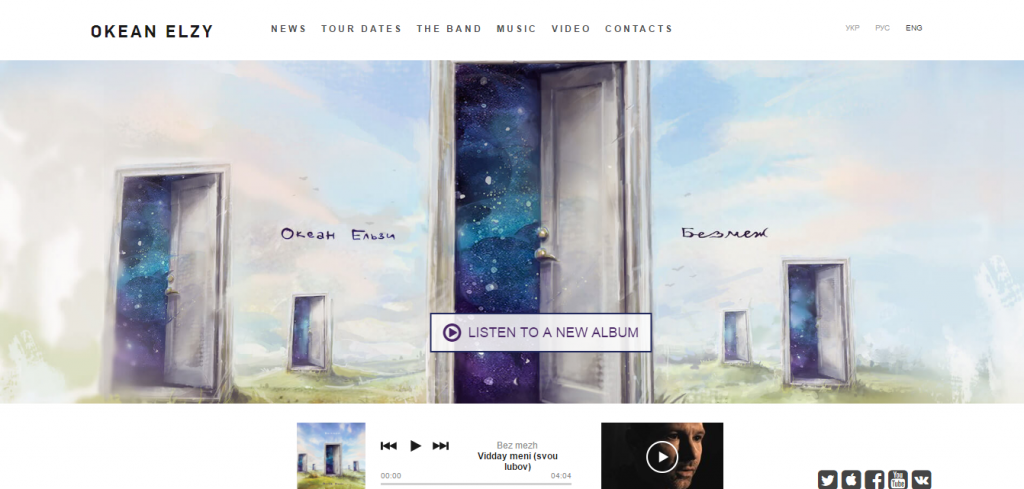
This is one of the leading navigation menus out there. Whenever there are static scenes, virtual talks, and interactive videos are being used, Interactive navigation can give you perfect results. This tool is all spiced with pragmatic features that catch the eyes. However, it is a huge hit menu as it promises its users that the website or templates shall be more engaging and impressive. That too despite the fact they are suffering from non-compatibility with devices and browsers.
Well, a leading example of this can be the ocean Elzy project which was a pioneer in art projects that brought this menu to life. Thus, it offers you an opportunity to make your site much more interesting and interactive. So, it’s time to indulge yourself in an amazing interactive walk!
2. Sidebar Static Navigation
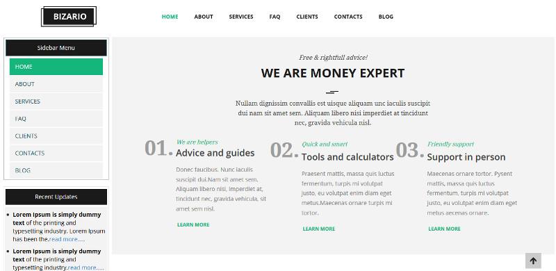
This type of navigation was trending in the market some years ago. Although, it is said that this menu gives more importance to compact and sleek solutions. You must have seen that many online magazines and blogs are using such menus. However, it will utilize a static bright color panel that is accessible on the left side to help you display all important links effectively. On the other hand, you can use the right side for scrolling purpose. Thus, it helps the menu to stay in the same place. Also, users feel comfier with this menu as all the links are easily accessible.
3. Parallax-Powered Navigation
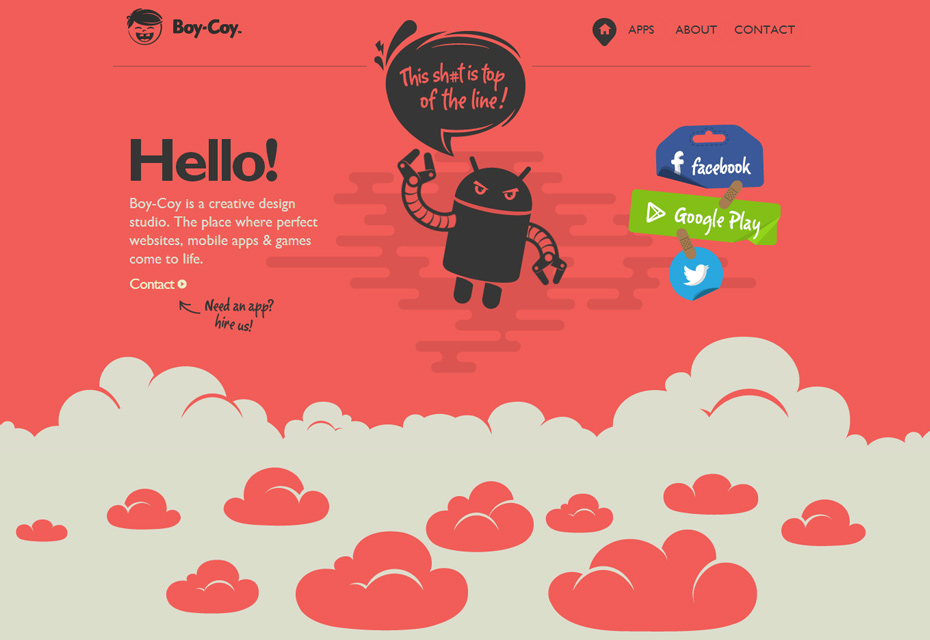
These projects are usually driven by the parallax opting for plain and simple navigation. They are generally graphically based. Circles are often accompanied by titles helping viewers by not allowing them to wander about. These circles utilize several lines-like structures corresponding with the titles and thus blend with the surrounding environment effortlessly. This approach also complements various designs giving users some important visual hints. Thus, helping them to stay on the same site and not get lost and wander around!
4. Hamburger Menu
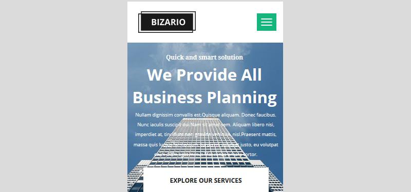
This navigation menu is the top choice of corporates when it is the matter of bringing all navigation links to one place. This menu is preeminent to be stylish, dynamic, mobile-friendly, and subtle. So, this type of menu grabs a lot of attention from people as it is stylish as well realistic. It works perfectly for a geometric feeling or a techno vibe prevailing on the web page.
5. Multimedia Based Menu
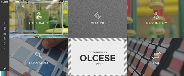

Videos and images are often helpful for supporting a variety of visual devices for items in the menu links. All thanks and regards to the modern technologies which allow us to incorporate loads and loads of multimedia even without having to sacrifice productivity, accessibility, and functionalities. Thus, this kind of navigation that relies on multimedia is on the way towards becoming the most likable navigation menu. Especially for its dynamic and lavish nature.
However, this also includes a hamburger button and footer navigation. That helps in taking up the entire screen shedding the focus upon only the important or vital parts of the description. Therefore, this navigation menu helps the website to be visually intriguing and appealing.
6. Centered Layout Navigation
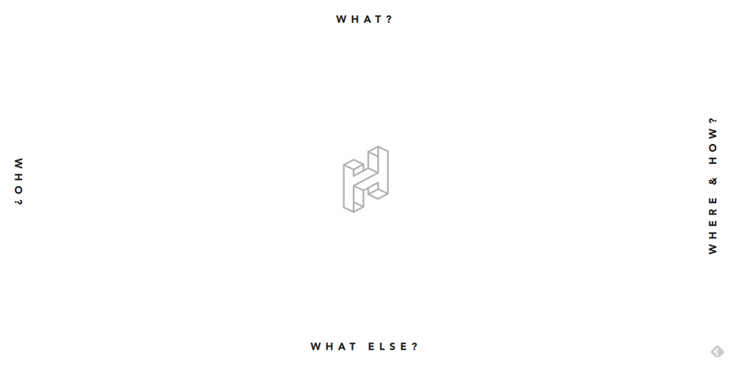
This navigation is likely to be scattered around the circumference of the welcome section giving an original and fresh look. It is famous for providing lots of free space to its owner in order to maneuver. But, this navigation solution comes with a specific drawback being it consists only of four particular items. So, anything more than 4 items will not be accepted by this kind of navigation. The homely feeling here becomes dominant helping to achieve an attractive and impressive impact on the users. This also helps to enhance consistency in the field of anesthetics.
7. Huge Drop-Downs
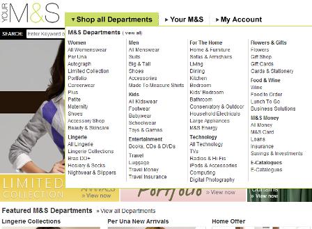
Huge and giant dropdowns are always a big yes to highly engaging websites. For instance, online newspapers, popular sports brands, multinational e-stores, etc. However, this menu is a multi-functional and complex component that extends over the screen entirely covering the breadth. It is popular for balancing images, videos, and texts. Furthermore, it also has some additional features such as a shopping cart that is trending on shopping sites like Amazon, eBay, etc. So, this has an enormous drop-down menu covering various sorts of information. Adding to this feature is the fact that it works pretty fast even when the chances of the page becoming nonresponsive is comparatively high.
8. Footer Navigation

This kind of menu is more similar to another traditional menu known as the streamlined bar. The difference is that this takes place at the bottom of the web page sticking to its previous position as the users scroll down. However, it is called footer navigation for the same reason. Although most of us are habitual to the tradition of searching for the menu on the upper part of UI. And this one though stands different from them. As it benefits some concepts which would distinctively require such kind of feature.
Best navigation Menus – In Conclusion
So, this is it! Unquestionably, there are numerous ways of showing navigation ranging from traditional or conventional efficient navbar to hamburger menus. But, picking up the one suitable menu strictly boils down to your requirements. That too after weighing them for their pros and cons. The trends are changing dynamically every year and bring a whole new lot of menus. What type of menu best suits your needs do let me know in the comments below. I would love to hear from you.
[call_to_action color=”gray” button_icon=”download” button_icon_position=”left” button_text=”Download Now” button_url=”https://templatetoaster.com/download” button_color=”violet”]
Design websites with Modern navigation menus just in few minutes using TemplateToaster website builder
[/call_to_action]
Build a Stunning Website in Minutes with TemplateToaster Website Builder
Create Your Own Website Now
Great examples, Terrible presentation. Was it so hard to provide either an animated gif/video of the navigation type in action? Or at the very least provide a link so we don’t have to manually search fo each example on the web?
You should decide if the hamburger menu is either “subtle” or if it “grabs a lot of attention”. Hard to imagine both. Hint: It’s just a lazy solution.
I think the title of this post should rather be “ways to organize the navigation” than types. For example, burger menu is a way of showing the navigation but if we talk about the type, then it is Main Navigation/Global Navigation. Another example, the sidebar example you have mentioned repeats the links that shows in horizontal menu, but still it remains a global or main nav.