What is Responsive Web Design? Uses Features and More
If you are thinking about why you need responsive web design, then you need to think again. Every new client wants a mobile version of their website. Recently, I have received many requests from my clients asking for mobile websites without losing the quality of the web version. However, it is not tough either but you need to know the process to do it rightly. In this comprehensive guide, you will learn the need to have a responsive web design and how to do it. The smartphone has taken the Internet by storm. And this is the primary reason for the rapid increase in the use of responsive web design technology. Do you want to learn the responsive web design? If so, then continue reading the post and find out more about this growing technology.
The number of mobile users is increasing at an astronomical pace. And so does the demand for the mobile version of sites. hence, the concept of responsive web design which is also known as RWD comes into play.
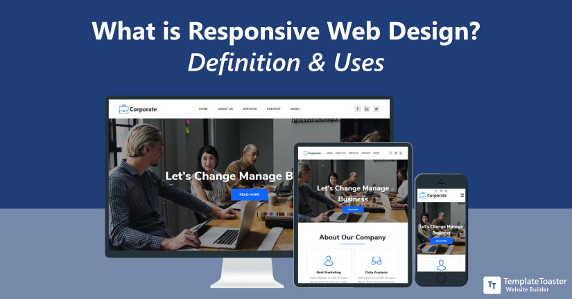
Responsive web design is a technology to design responsive web pages. That means pages are created in such a way that they should be able to respond according to the user’s behavior such as a platform, screen size, and orientation. In this article, you will learn the fundamentals of responsive web design. Furthermore, the benefits of having a fully responsive website for your business.
When you use responsive web design for your website, it is like making sure that your content will render differently depending on the screen size of the device. Thus, every visitor on your website will have an optimal viewing experience regardless of the device size. However, the major benefit of the responsive web design is that your website loads quickly.
What is Responsive Web Design (RWD)?
Term Responsive web design (RWD) coined by Ethan Marcotte is a technique or an approach that lets you design a website which works perfectly on every device irrespective of the screen size. It is a web development practice of providing optimized and user-friendly web pages that work flawlessly across a wide range of devices and web browsers. This method involves images, layouts, flexible grids, and media query (@media). Using all these components in a website makes it compatible to accommodate resolution and scripting abilities of varied devices.
The responsive design technique makes your website respond immediately and automatically according to user’s preferences. Thus, you don’t have to create a website for mobile phones and desktops separately. Basically, the elements used in the responsive website are capable to respond differently on different devices.
A responsive website is the one that has a flexible and fluid layout that dynamically adjusts itself according to the screen size it is viewed on. Simply put, responsive web design is that which does not require to be manually aligned in order to view it on different screen sizes. Whichever device your users will use such as laptops, smartphones, tablets, etc. the website layout will automatically adjust itself to get fit in the screen size accordingly. The responsive web design approach involves flexible grids and layouts, and well-designed CSS. You can easily learn web design. For instance, if a user is currently viewing a website on a personal computer and then he shifts to a smartphone, a website should be capable enough to accommodate for resolution. While keeping all the aspects of a website such as images, text, and the entire layout of the website well in form. A responsive website should involve the technology that automatically responds according to the user’s preferences. Let’s now learn the benefits of having a responsive web design.
How Does Responsive Web Design Work?
Unlike traditional fixed websites which use pixels, responsive websites use fluid grids. Each page on your website is sized by percentage. Let’s suppose you have four columns, you need to define how wide they should appear in relation to other columns, rather than how wide every column individually should be. And this doesn’t limit here, all the images are managed and resized in the same manner. So that even they should remain in its column.
Responsive web design can take a little practice to get it right. Therefore, you can use frameworks rather than wasting your time and efforts for replicating a design. You can use responsive web design frameworks like Bootstrap or Foundation to create a website.
Benefits of Responsive Design
- Improved user experience regardless of device size
- Fully SEO optimized site to attracts more visitors
- Highly cost-effective
- Easily scalable design
- Boost traffic that leads to more sales and conversions
- Flexible design that can flow through all size screens
- Easy to maintain a site
- Better reach for customers on smaller devices
- Saves time and efforts
- Analytics and reporting takes place at a single place
1. Enhanced SEO
 The primary advantage of having a responsive web design is an improved search engine ranking. When Google ranks a website, it considers every aspect deeply. If your website is responsive, Google will consider it as one of the important standpoints to rank it. According to Google websites that are not responsive, they are ranked below the website which is responsive. Google takes into consideration the responsiveness of your website as one of the characteristics that help determine the rank of your website in the search results. You may make use of many simple and practical strategies to boost your WordPress SEO.
2. Improved User Experience
 User experience is another important factor that can be a bigger reason for the success or failure of any website. Responsive web design has the power to improve the user experience irrespective of the device or screen size. Websites that are easy to navigate and simple to render on any device are the most likable websites. Whereas, if your website scales and easily responds to the change in the screen size, then surely no visitor will have to face any sort of problem while visiting your website. However, the main troublesome areas can be menus, buttons, hyperlinks, etc. A responsive website doesn’t show any problem while managing all of these defined areas. In fact, it delivers an amazing user experience to its users.
3. Easily Scalable
Scalability is one such element that gives a sense of scale-up anytime you like. When you are having a responsive website, you have the flexibility to extend your website as and when required. There are numerous tools and devices from small to large resolution sizes. A responsive website lets you scale up or scale down your website. With every passing minute, technology grows and expands in a form that the previously built websites or other web apps need to be updated. That’s why with any app you use, there’s an update almost every week. Web apps and websites that have responsive web design will be ready to meet those new updates and other requirements.
4. Easy Maintenance
A maintained website is easier to attract visitors to your website. However, there are always two versions of a website one for the developer’s team and the other for visitors. You can try new things with the saved version of your website whatever you want to experiment with. With a responsive website, the maintenance time reduces, and the main focus shifts on other things such as A/B testing, product improvement, content creation, etc. Running a responsive website is like owning a digital presence with the ability to do things on your resolution preference.
5. Enhanced Mobile Traffic
These days more and more traffic comes from mobile devices. However, half of the internet traffic is generated from mobile devices. Therefore, you can not afford to forget having a responsive web design. Whatever business you are running, a website is an essential aspect to generate leads. When you analyze your website traffic you will see the difference and then you will realize how important it is to make a website responsive.
6. Better Conversion Rate
Undoubtedly, when more people will visit your website, the chances of conversion gets higher. When visitors tend to spend much time on your website, it is evident that your bounce rate will automatically decrease. However, merely having a responsive website doesn’t make sure that you will have less bounce rate. There are certain things that are essential and need to be aligned in a proper manner so that you can attract visitors, and they will stay for long. When you provide the flexibility to visit your website from any device of customer’s choice, the conversion rate is more likely to increase. However, you should try conversation rate optimization to reap more benefits of digital marketing.
7. Boost Marketing
If your website is capable enough to deliver exact same results regardless of the device size i.e. desktop version, mobile, laptop, tablet, etc. and it can easily cater to different device needs makes it simpler to integrate marketing strategies. However, if you were having a website that has different architecture depending on the device size, then implementing marketing strategies can be really challenging. You may use various tools such as adding Google Analytics to analyze your website traffic. And then you will realize how much traffic is coming from mobile devices alone. Thus, you can plan your marketing campaigns accordingly.
8. Eminent Backlinking
Responsive websites attract top websites in the same niche. When you search in the same industry you will see there are giants who are already present there and who have already made their mark in the industry. So, you can try to get backlinks from them. But here also the concept of responsive websites comes into play. Certainly, no website would provide backlinks to a website that doesn’t have optimal device presence irrespective of its screen size. So, make sure your website is responsive in order to get quality backlinks.
Cons of Responsive Web Design
Undoubtedly responsive web design has plenty of benefits to offer, but so, of course, some difficulties too that you have to overcome in order to make your site a success.
- Additional HTML/CSS needed:
As you may know sometimes lot of additional HTML and CSS need to be added for a proper responsive display, and it adds up to the load time and complexity. For example to add a pricing tables you need to add a table structure for Desktop displays and a Div based structure for mobile devices and you’ll be hiding one depending on the viewport.
- Compatibility issue with old Browsers:
Lots of old web browsers do not support latest web standards and hence the Responsive Web Design implemented by you using latest techniques won’t work there.
Things to Consider for Responsive Web design

The responsive web design implement some basic fundamentals that makes responsive web designing possible. Every web design framework, as well as CMS, or your your Web Design Agency is required to abide by the following features.
1. Fluid Grid
A fluid grid is the base of responsive web design. A grid basically enables you to align elements on the page and then place them beautifully. However, there are certain things that need to be followed in a hierarchy. The fluid grid-scale based on the size of the device. However, the grid system has always been present there, but the responsive web design makes use of a fluid grid system in a different way. There are several responsive CSS frameworks that you can use and they all have a fluid grid-based system. However, there are some native grids that have into the picture in the form of the CSS Grid Layout Module. In fact, browser support is also pretty strong, they support responsive grids without having to rely on frameworks.
2. Responsive Media
Responsive web design works beautifully with simple plain text. But as you must have noticed, nowadays mostly websites include a lot of media files such as videos and images. And when it comes to managing media files, it can be a little challenging. But nothing is really tricky when you are using a responsive framework for your website. All the media file adjustments are in a way that you don’t have to worry about how they will look on your user’s device. Because they will look and work perfectly. Every image and video will automatically scale with the browser.
3. Media Query
A media query is an HTML/CSS functionality that enables the web page content to adjust according to the type of media that page is being rendered on. This is the core technology for implementing responsive web design. Media query involves a media type as well as one or more expressions that conditionally check for some media features especially that of screen size.
Additional Resources to Learn Responsive Web Design:
A List Apart
W3Schools Responsive Web Design Tutorial
Google Responsive Web Design Get Started
Why Do You Need Responsive Web Design – In Conclusion
So, this brings us to the end of this extensive guide. However, the need to have a responsive website is well-explained. Whereas, a quick catch up on your website traffic will clearly reveal how much traffic you are getting from mobile devices. Your website should be responsive enough to offer the best user experience. However, users’ experience is directly proportional to driving up sales and generating leads to your business. However, if your website is not yet responsive, it’s high time that you should redesign your website and take a responsive approach. It is not only low maintenance but highly versatile and provides amazing user experience. If you are not sure about your web design skills make sure you hire a professional web developer to create an intuitive and fully responsive website. Whatever your experience is, do let me know in the comments below.
Certainly, this age of web design and development is more demanding and keep up with the latest trends, and you need to be at the front foot all the time. Responsive web design can be your best stepping stone to stay ahead of time. And astonishing web design software like TemplateToaster is always there to reinforce your online presence. You need to see it for yourself to believe it. However, Google also gives preference to websites which are not only available for desktop but also, for other devices like tabs, smartphones, laptops.
So get your fully responsive website today and feel free to drop your queries in the comments section below.
Build a Stunning Website in Minutes with TemplateToaster Website Builder
Create Your Own Website Now
Can we make Responsive theme using TemplateToaster from scratch?
Btw Nice article.
responsible web design is really effective because we can see the website on our phones easily.
It is important to learn about responsive web design, it helps for more views and increase traffic on the website.
well, benefits are overcome to all cons of responsive web design.
Do we need to install any additional software to make our design responsive?
According to my experience, responsive web design is easy to manage as I always follow that designs.
This is an amazing article to provide information about responsive web design, I really appreciate it.
Which Responsive Web Design Framework is the best in 2023 ?
I use following CSS Breakpoints:
Mobile Devices: 320px – 480px
Tablets: 481px – 768px
Laptops: 769px – 1024px
Desktops: 1025px – 1200px
TV and other Large Screens: 1201px +