The What, Why & How of “Sticky Elements” for WordPress Theme

Sticky posts in WordPress is what will make or break your website. These days, if your website is hard to navigate or looks outdated, you surely lose your audience. Sticky contents great to use in sticky pairs or inside a container.
The main purpose here is to ensure that the sticky content remains constant. So if you’re building a WordPress site, you might want the sticky posts in WordPress to be visible to the browser viewport while another column filled with content is visible on the web page.
WordPress sticky posts are anything like company information, social media sharing buttons, content blocks, and other forms of sticky navigation. Although there is an ongoing debate about utilising sticky elements, even the fiercest critics accept that it provides an effective design approach when it’s done properly.

So when you use sticky elements, they will remain fixed on the page as the user scrolls up and down. But to get the desired response from your audience, you have to have a clear purpose and design the sticky user interface (UI) elements well.
This method makes a website more responsive while ensuring that ads, ancillary content, and links remain constant while the user engages with the main content on the website.
In other words, sticky UI elements in a site like a WordPress sticky menu or a WordPress sticky header has the potential to maximise the value of each visit. If done correctly, guide the visitor through the site and lead them to calls to action where they signup for your newsletter, like your page on social media, or even give you a call. At the end of the day, improving a WordPress theme with sticky UI elements will enhance user experience (UX). So it’s no surprise that loads of people have jumped on the sticky elements
At the end of the day, improving a WordPress theme with sticky UI elements will enhance user experience (UX). So it’s no surprise that loads of people have jumped on the sticky elements CSS bandwagon.
How Sticky Posts in WordPress Work?
When you start building a website, designers have to consider the cultural influences that may have an effect on UX. When you add conversion rate optimisation (CRO) to the mix, the sticky element stands out. This is because sticky elements make the experience easier (you don’t want your visitor to get lost while browsing). As a result, sticky elements have a considerable impact on e-commerce.
But regardless of the type of website, using sticky UI elements in WordPress be harnessed by carefully planning ahead. You have to decide which elements are going to be used and where you’re going to use them.
Unfortunately, it’s not as simple as downloading a plugin (there quite a number of UI elements plugins out there) and activating it. Some of these elements may not do exactly what you want them to without a bit of coding.
For example, the CSS code for pushing:true will look like this:
[box title=””]
$(‘.ui.sticky’)
.sticky({
context: ‘#example2’,
pushing: true
})
;
[/box]
But if you don’t have any coding experience, there are options for you as well. For example, you may use TemplateToaster to get around all the coding issues and focus on the design. This negates the need to bug your programmer friends or scouring the web to find the appropriate code to make your website stick.
Add a WordPress Sticky Posts through the Menu

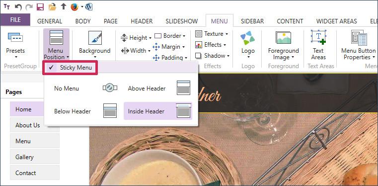
The WordPress sticky menu is probably the most natural element when compared to all the other sticky elements. It’s also the most useful feature in a website and even more so now that most people are browsing from mobile devices.
When you add a WordPress sticky menu, as the user scrolls down, the menu will remain constant. You do it in many different ways. Simply place it on the top left of the page, have a simple menu that expands when you hover over it, place it firmly on the side, or place it right at the bottom of the page.
No matter where you place it, the menu feature shouldn’t take up much real estate. Further, it shouldn’t take the attention away from the site’s header.
[call_to_action color=”gray” button_icon=”download” button_icon_position=”left” button_text=”Download Now” button_url=”https://templatetoaster.com/download” button_color=”violet”]
Best Drag and Drop interface to Design stunning Sticky Menus for WordPress Themes
[/call_to_action]
Add Sticky WordPress Posts using the Information Box

If you want to communicate your contact information clearly and effectively, a sticky information box shall help. It must be displayed prominently with a call to action or be prominent enough to be processed at-a-glance.
This part of sticky elements is quite simple because you just have to add text, a phone number, and maybe hyperlink to your email and implement it to your site. One thing to note when creating a sticky information box is that you need to ensure that it’s not a distraction.
Get Responsive with a Sticky Email Signup

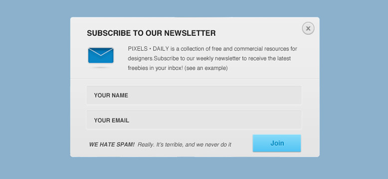
When you’re operating a website or an e-commerce platform, building a database of your target market is important. One of the best ways to do this is to get your visitors to subscribe to your newsletter or offers by providing their email address.
This is where sticky forms come in to help build your mailing list. You have to find a good way encouraging people to share this information, sticky elements CSS will do the rest.
Moreover, implementing a sticky form on the top of the page or on the sidebar. Also, link it at various points in the site where you use your call to action to encourage them to sign up.
The stick form also is utilised along with a WordPress sticky header that is prominently displayed without being overly distracting. But this doesn’t mean that you cannot use it in different places for people to sign up.
Get Responsive with Sticky Social Media Buttons

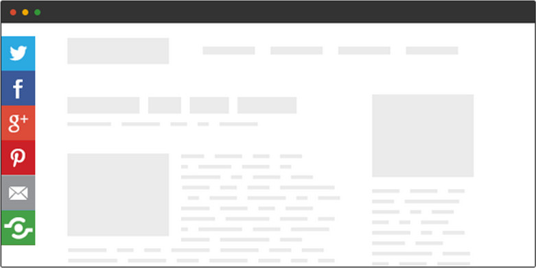
Social media drives traffic to your website, so it important to keep engaging with social platforms to remain prominent. For example, if you have a blog on your website, add social buttons so your visitors shall easily share it with their social media page.
A good way to go about it is to use social media buttons to go along with your content. There are loads of plugins that help you add sticky social buttons on WordPress, so make sure that you take advantage of it.
When choosing your sticky social buttons, make sure that it works with your theme and goes along with the overall design. Further, make sure that it works on mobile platforms as well (TemplateToaster WordPress website builder makes this process easy).
How About a Sticky Ad?

You may not be a fan of ads, but sometimes they’re necessary to pay the bills. One way to do it is by using a sticky block that scrolls down with the site, remaining in the user’s view.
It’s a better option than the alternative where you use a pop-up ad. But regardless of how you do it, advertise in moderation or you will lose your audience.
Wrapping Up- WordPress Sticky Posts
Sticky posts in WordPress are a great way to build a modern responsive WordPress Site. But it’s not easy as downloading some plugins and activating them unless you use a third-party solution like TemplateToaster WordPress website builder and website builder software.
A WordPress sticky elements allow you to place the WordPress elements based user’s scroll percentage. Also, the CSS helps in programming the sticky elements based on position and property value sticky.
As all the necessary code is already built into the software, and easily develop web pages with sticky UI elements. This, in turn, will significantly accelerate your website development.
Build a Stunning Website in Minutes with TemplateToaster Website Builder
Create Your Own Website Now
Thanks for the motivating tutorial for the sticky menus! To inject sticky ads, I am using Advanced Ads (https://de.wordpress.org/plugins/advanced-ads/) with the sticky add-on . If you want to make sidebar elements sticky, I can highly recommend the plugin Q2W3 (https://de.wordpress.org/plugins/q2w3-fixed-widget/).
Adding sticky post to the website makes the more responsive and interacting.