How to Design A Landing Page That Really “Converts”

Looking for ultimate tips and tricks on how to design a landing page that is conversion-centric? No doubt, as a business you’ve just one clear-cut goal in mind- “to convert” as much as possible. Landing page is your golden opportunity to entice your potential customer. A flawless design and a faultless copy together makes for a successful landing page to capture leads. Read on to find out how to “click” with the visitors of your landing page, right off the bat!
Fancying about steady conversions from your website’s landing page, but with no or little success? Do you want to send traffic to campaign-centered specific pages and expect the visitors to turn into buyers as soon as they arrive or “land” on your page? Here at Templatetoaster website design software, let learn How to design a landing page that really converts.
We guess – Yes! High converting landing pages is an inherent wish of every inbound marketer out there to promote a business online whether it’s B2B or B2C. Also true is that it is one of the biggest challenges faced by the marketers.
“Getting landing pages built and tested is one of the top five challenges faced by B2B marketers”
(Source)
You must’ve heard about the success stories of the brands owing the credit of hike in conversion rates to landing page optimization. But, it also comes with an indispensable need to know the ins and outs of how to design a landing page to get rid of the loopholes for Conversion Rate Optimization.
Surely, it’s a tempting move to use landing pages as an inbound marketer. However, you can easily go off the road in this overwhelming situation. You’re likely to underestimate the hard work (read it ‘smart work’) it takes to create a perfect landing page for capturing leads.
Landing Page: A Secret Weapon in your Marketing Arsenal
Landing pages are the powerful weapons of any marketing strategy and a favorite among many marketing experts. As long as they are deployed with a set goal and user psychology in mind, they are sure to be your perfect companions in business marketing methodologies.
Landing pages act like a weapon which can have targets like:
- Promoting newly launched/ existing products by creating e-commerce landing pages.
- Reaching new customers through ads on social media through lead gen landing pages.
- Increasing conversions through deals and offers.
- Growing the email list or subscriber base.
- Getting insights and data through lead forms.
- Spreading awareness about the brand.
Till now, you may simply know that what is a landing page. But, it’s worth knowing that an effective and winning landing page is a fusion of visual simplicity through careful designing and precise execution.
Take our word for it, there is no magic or extraordinary powers working behind an “attention-driven” landing page. All it takes is a thoughtful design blended with a powerful copywriting and landing page best practices.
The integral factors that decide the success rate of the landing page are:
- User-experience
- Usability
- Design
We’ll talk about the key pointers surrounding these factors. We’ll also show you how to design a landing page step-by-step in a way so as to generate maximum leads in no time!
For now, we are going to sprinkle the magical tips and tricks curated from the mavens of the marketing world to help you build landing pages to drool over.
Landing Page Design Best Practices
We can’t stress enough on what these key points can do for optimizing your website’s landing page. Consider the following points as golden principles that segregate a “trash” design from a “winsome” landing page. Use a combination of these elements and don’t over do it. Pick the elements you think, will best suit your business goal. Of course, a perfect landing page generates leads that are a treasure trove for your business.
- Visual Simplicity is Easy on Eyes
Keep the landing page as decluttered as possible! A messy page full of chaotic elements is a big no. The simplicity of the design and scannable content is what the viewers find appealing. Images, if used, should be of high-resolution quality. Use page chunking methods to divide the page to aid in scrolling through a landing page which is a long read.
- Add Weight to your Landing Page
Your landing page should’ve testimonials- honest ones, please! To make your landing page more credible, it always pays to put testimonials which have social proofs. Put the spotlight on your Unique Selling Proposition. Is your product out-of-the-box? Is it a rare innovation? Highlight it smartly! Has your brand been featured on high ranking websites or feature articles? Flaunt it with pride and place the logos or proofs in an as succinct manner as possible.
- Set a Single Call-to-Action
Do you want your prospects to do the swinging and oscillating when they have successfully landed on your page? Absolutely no. Right?
“48% of landing pages contain multiple offers” (Source)
Make sure that your website’s landing page is not among these 48% landing pages. Keep your business goal as clear as possible with a specific landing page. Set a single CTA for the landing page and never ever give options of 2 or more CTAs to your prospects. But, you can use repeated “same’ CTA buttons for a long landing page.
- Directional Cues for Hints
Your prospects love guidance as all human beings do. Try to incorporate directional cues while designing a landing page. These can be in the form of arrows, hands or other creative icons. Place the arrows where you want to fetch the most attention of your visitors. Take a lead capturing form, for example: Try to limit the use of these arrows as you definitely don’t want to put your visitors in a fix.
- Let the Balance Rule over
Keep in mind that the theme color or color contrast of the website landing page design shouldn’t look out of the place. There should be no distraction from the CTA, no matter what! Natural flow should direct the visitor to click and take the steps as expected. A neat header with logo & minimalistic menu buttons and excluding the footer are the signs of a best landing page design.
- Images Speak Louder than Words
“A picture is worth a thousand words”. This is no exception when it comes to designing high converting landing pages. But, don’t use over-loud imagery as it leads to distraction. Use high-quality images for the background that will want the user to immerse into your landing page. Beautifully designed landing pages along with images can prove to be the best lead-gen landing pages.
- Smart Use of Videos
Videos which are “honest and fair” testimonials from the clients or customers are a great selling point for a brand. Try to shell out honest testimonial videos from the customers or from the clients.
“Using videos on landing pages can increase conversions by 86%”. (Source)
Product demo videos that can push your prospects to say “I’m sold” are definitely fruitful for e-commerce landing page, lead capture landing page and so on.
- Responsive Landing Page
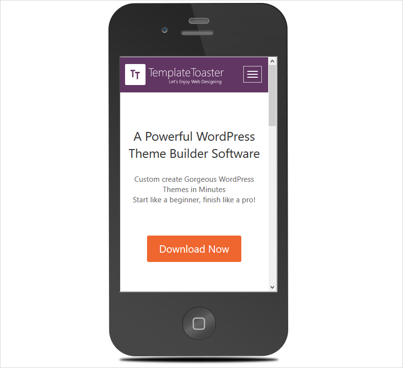
No doubt, most of your prospects use smartphones today. It becomes immensely significant that you know how to create a high converting landing page. This should be responsive so that a wide range of your target audience can access your website landing page. Here is our website’s landing page which is designed using a website maker TemplateToaster and is fully responsive!
Content is the King. Always!
As is true with content marketing methodologies, content remains the top priority here too! Keywords are crucial. More than that, a persuasive copywriting practice helps you win over the prospects in no time. Word of caution: Don’t write salesy content! Make your product/ service/ offer look ridiculously useful to your visitors that they can’t live without.
- An Effective & Catchy Headline
Entice your visitor with a catchy (read it seductive) headline on the landing page. The headline in bold is the first thing your visitors see when a landing page loads. The first impression counts a big deal! Keep it clean-cut and brief. Don’t sway from your real business goal though to make it quirky. It should hold substance yet creative and clearly conveys what you’re all about.
- Short & Succinct Introduction
Answer the questions which can hit the mind of your prospective visitors and buyers. Write about what your product or service is? Why should they care? Keep it brief and to the point. Use headings, subheadings and bullet points. Writing about the features of your product is a great idea to incorporate into an e-commerce landing page design.
Types of Landing Pages and their Cool Examples to Spur your Creativity
Not sure where to start? And how to use the above said best practices to create killer landing pages for your website? Don’t fret! We have got a whole lot of awesome bunch of landing pages which are the best from the rest.
Before we move on to designing a landing page using TemplateToaster, have a look at what these cool and quirky landing pages have to offer to fuel your creativity.
- PPC Landing Page
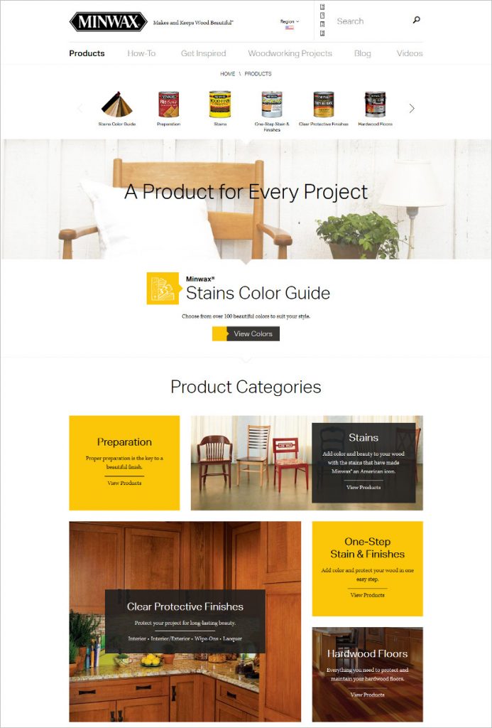
A landing page specifically made to capture leads from the paid clicks on the ads. According to Wikipedia: PPC is the amount spent to get an advertisement clicked. Inject some emotional triggers to drive the prospects crazy to click on your CTAs. Here are the picks of our favorite PPC landing page examples.
- Ecommerce Landing Page
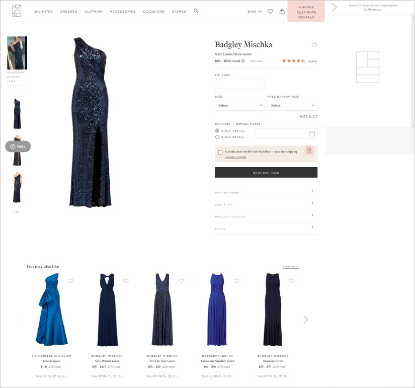
A dedicated landing page is very essential for the e-commerce promotions, whether it’s through social media ads or elsewhere. You are driving the potential customers to a landing page which is a specific page with deals and offers. It is pivotal to see that the design is coherent. Here are a few e-commerce landing page examples.
- Product Landing Page
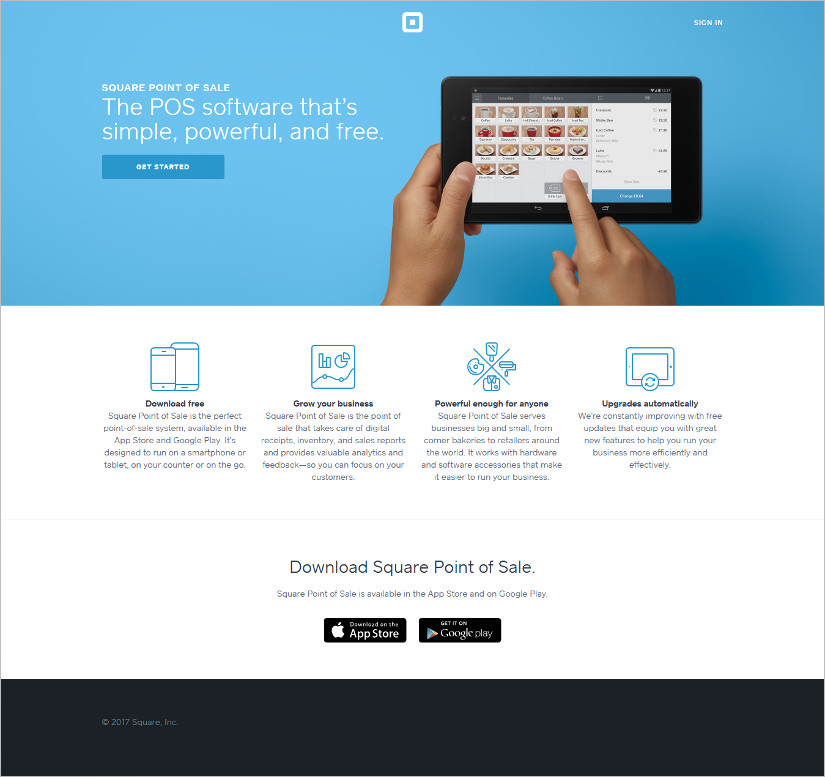
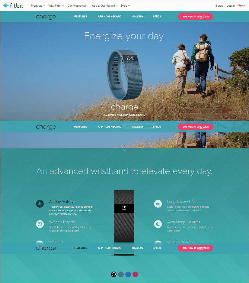
The product landing pages are dedicated pages for a specific product which showcase the features and benefits of the product using the catchy content. Impactful videos, images, and demos of the product are included. Along with this, well-placed CTAs make the perfect product landing pages. Here are some of the best product page landing examples.
- Ebook Landing Page
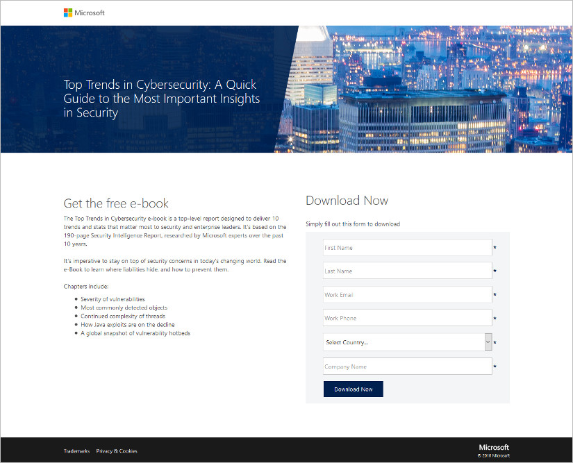
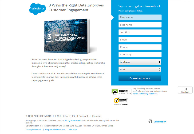
As is the case with other landing pages, ebook landing pages are dedicated to capturing leads and driving sales for a particular ebook- a digital publication. It should tell the prospective readers that what exactly is the ebook about and the price of the ebook. Use the best placements of the CTAs and lead optimized forms. Find inspiration from these ebook landing page examples.
- Services Landing Page
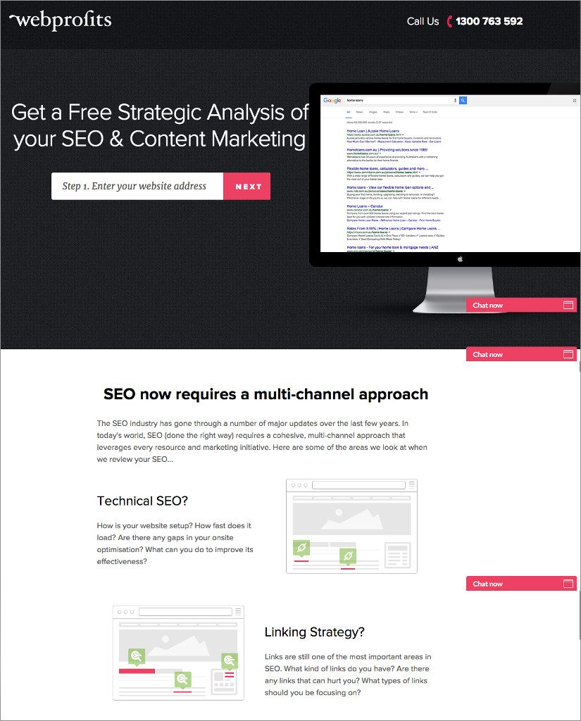
It is a standalone landing page devoted to a catalogue of services. It should be designed in such a way that helps generate readers’ interest in trying out these services. Price, description, expertise, testimonials and other points should be made a part of the services landing page design. Take for example, a website for spa must tell the readers about the hours of operation and prices charged for a particular service.
How to Create a Landing Page in WordPress
For demonstration purpose, we’re going to show you a step-by-step tutorial on how to create a landing page in WordPress using TemplateToaster theme builder software.
Why use this dynamic drag and drop theme builder software at all? You may ask. Well, the truth is WordPress themes are quite limited in terms of what you actually expect out of your landing page- to reach the target audience with specific offers/ products and more! So, what would be the whole idea of designing a landing page if it can’t be different from your mainstream website pages like Homepage etc.?
Furthermore, it would be a lot easier and faster for anyone out there ready to design landing pages to switch to a drag and drop theme creator software. Quite a smart move. We applaud it!
Designing a landing page for any type of website is a no-brainer with TemplateToaster – a wonderful theme designing software. You get a ton of styles to choose from to create a landing page that is it’s creative best.
It’s worthwhile to know that while creating a landing page that generates leads, you must apply the landing page best practices that we told you in the earlier section of the article. Let’s get to designing now.
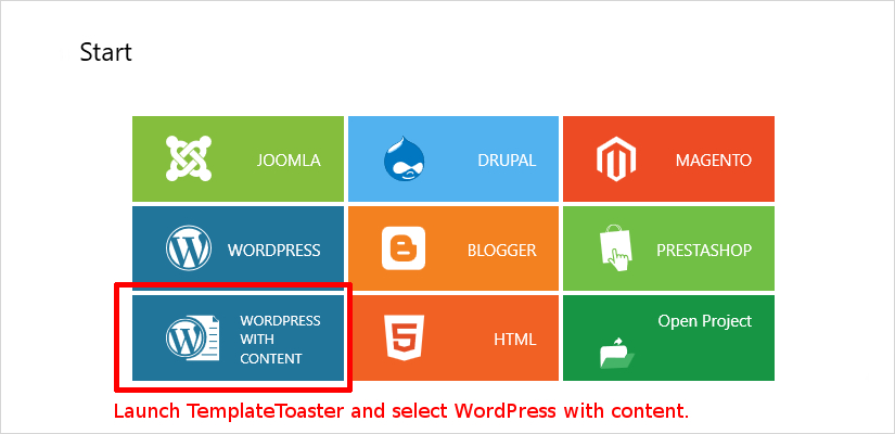
1. Launch TemplateToaster
Initialize TemplateToaster and choose WordPress from the list of CMSs. It supports various CMSs like WordPress, Joomla!, Drupal, Magento and more!
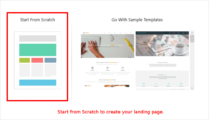
2. Start from Scratch
Start from scratch or choose from pre-designed templates or begin building the page from the start. Designing a landing page with this wonderful software is as easy as A-B-C.
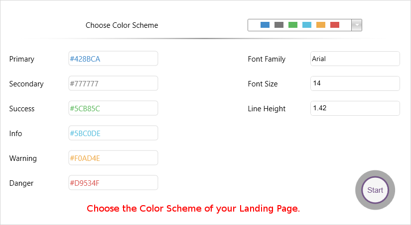
3. Choose the Theme Color of the Landing Page
In this dynamic theme generator software, you get many options to choose the theme color of the landing page you’re about to design.
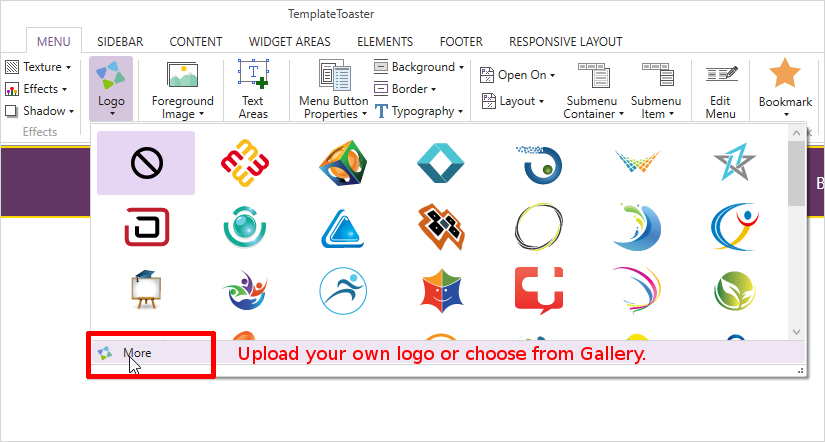
4. Upload your own Logo or Choose from Gallery
In this step, we’re going to place the logo on the left-hand size of the page. Choose any position of your logo but we suggest to place the logo at the bottom left-hand side corner of the page. You can upload your own logo or choose from the gallery of logos that come bundled with this software.
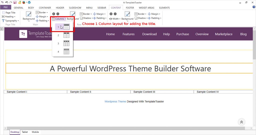
5. Customize the Layout of the Landing Page
In TemplateToaster, you get the options to customize the layout of the page as per your desire. In this step, we set the layout of the page to 1 Column.
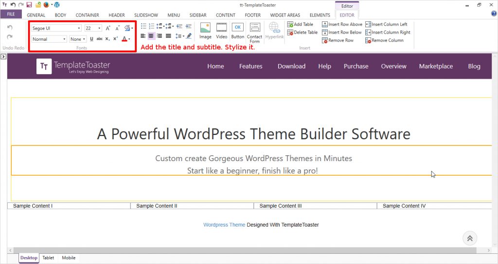
6. Add a Title/ Sub-heading and Stylize it
Now is the time to add text to your landing page! Do you remember from the best practices above that content is the king of the landing page? You can easily stylize the typography of the content to make it look attractive. Font color, style, size etc. can be changed easily in this drag and drop theme generator software.
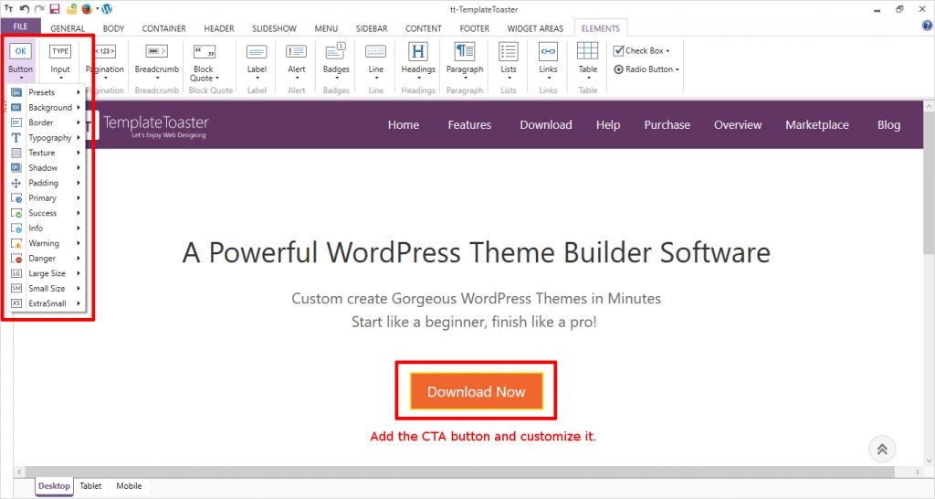
7. Add CTA button. Customize the Button
After adding content to your landing page, it’s time to place your CTA button to the page. Choose from the many styles available for the button and you can change the text and font style of the text on the CTA button. Keep the CTA button of contrast color according to your theme but don’t overdo it. Remember, we want to keep the design as decluttered as possible.
8. Chunking of Text into Columns
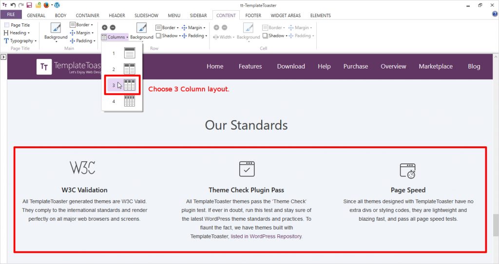
For the next folds of the page, we chose to write in an easy and skimmable manner. Choose the 3 Column layout of the page for this. This is to give readability factor to the page. You can choose from the 1 Column, 2 Column and 3 Column layout for the page and divide the text for an easy read.
9. Add Graphics or Images
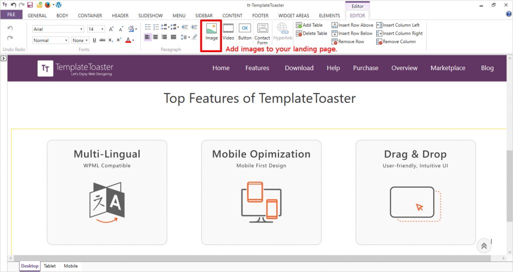
Adding images or graphics on a website landing page using TemplateToaster is a cakewalk. Just Upload the images in the Content tab and place wherever you want to place them. Adjust their height and width as per your requirement. You can also add YouTube Video from this tab.
10. Add Footer
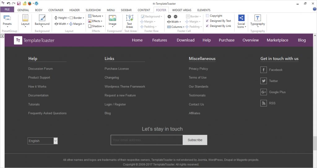
Choose the footer layout from the options available in the Footer tab. You can choose from 1 Column to 12 Columns for the footer. Choose the size of the footer and you can also add Social Media Icons in the footer. Stylize the font color & type etc. for hover text, visited text etc.
That’s it! This landing page is live here.
What’s the Bottom Line?
To put it in a few words, landing pages are sine qua non to increase the conversion rates. By just including a landing page into your inbound marketing strategy, you can’t be sure of the hike in the conversion rates, until you reach the best practices or better called – golden principles to successful landing page design.
A few words of wisdom: Don’t put distracting elements on your website’s landing page that may hurt your business! It hurts badly.
Build a Stunning Website in Minutes with TemplateToaster Website Builder
Create Your Own Website Now
Great. Thanks for sharing.