There are various modern navigation menus available that you can use for your website. But deciding which solution can give you the best results can be intimidating. So, in this guide, I will show you some of the leading modern navigation menus that you can use on your website. They will help you make a good impression on your audience. So, without any further stay, let’s quickly dive in!
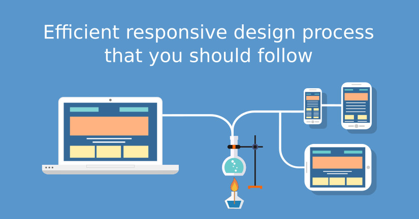
Responsive design has no longer remained as a jargon! It is what almost every webmaster and designer is well-aware of. In spite of so much awareness, the workflow of responsive design still remains very mysterious.
Imagine the struggle of reaching a destination when you are not aware of the exact directions! Not anymore. To make your task easier and to ensure that you have the best responsive design in accordance with the industry’s standards, let’s have a look on an effective responsive design that you should follow to ensure the best results every time.
There is no denying the fact that web designing has been an integral aspect of any website always. It is the most fundamental factor which grabs the attention when a user first lands on your website. Since the web design was introduced, custom web design is one thing which has been one among many important elements in designing of the web and also its development.
Magneto has become the trending online business solution, that exists during last 5 years. Magneto is a leading ecommerce platform having above 27% market share. Magento has been used and downloaded over 4 million times and now Magento 2.0 is following the same path. Magento 2 has come with new updates and features; this new version of the platform plays an important role in the growth of e-commerce market. In this article you can find the best updates and amazing features of Magento 2.0.
Material Design is a design technique or language, which has been developed by Google. Probabilities are that you have previously come across material design if you employ Google products. The design intends at unite the skill across platforms and diverse dimension viewports. If you are a layman, you may not perceive much of dissimilarity between flat design and material design method.
Today’s world of business is extremely competitive. This makes it essential for every business owner to understand the best ways for them to promote their business. The overall goal is to get their brand name out there so consumers can see what their particular company is all about. But how to go about doing this? What is it exactly that a business needs to do in order to ensure they can stand out from their competition? They need a website.
Incorporating simple yet stylish fonts throughout the website contribute significantly as various other factors do to attract the audience. Although the Internet is flooded with a plethora of websites from where you can download free as well as paid premium fonts but how many of them you can browse through. So, to ease off the process, we have battered a lot to chalk out the finest selection of websites that offer a portfolio of free fonts.
Designing your website without using services of a web designer may sound gawky but owing to some selected web design tools, you can make great websites yourself with little technical knowledge.
Learning PHP is a great way to understand how websites work on the server side. This guide walks you through every step of coding your first PHP web page, from setting up your local environment to mixing PHP with HTML and adding basic logic. It’s a practical and easy-to-follow starting point for anyone new to web development.
Often Web Designs are made to look attractive to the visitor, neglecting the other elements such as to make it Search Engine friendly , reducing page load time, etc. Some unique ways to improve make web design.
What do you focus on while designing a website? Undoubtedly it should be should be user friendly, but is it search engine friendly? Here are the five website designing tips to make your website SEO friendly.
For designing a blog post or website, integrating images have become a great deal. Visuals give a great understanding of our product/service. By incorporating images we can enhance the visual representation, and to find images that are license-free or licensed but only require attribution, is no less than a struggle.
Doesn’t it seem too tiresome and tedious when a website takes an extra fraction of second to load? Speed up your website and save the bandwidth by polishing your bloated images using these top image compression tools mentioned below.
