Opt-in Forms: The Evolution of Pop-ups to Capture Email Leads
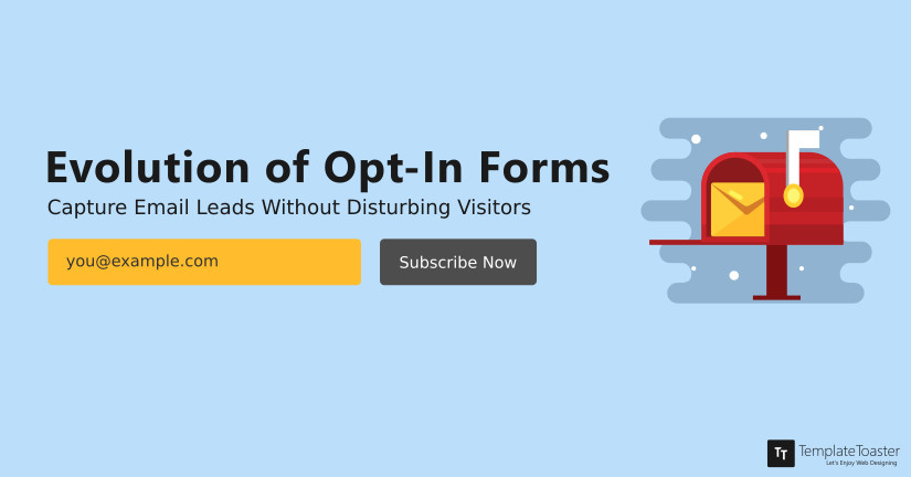
Cold-calling, Spamming and In-face advertising, are not just bad for business, they are annoying! So how do you reach your customers without being invasive? Well, by simply opting to give Opt-in forms a thumbs up!
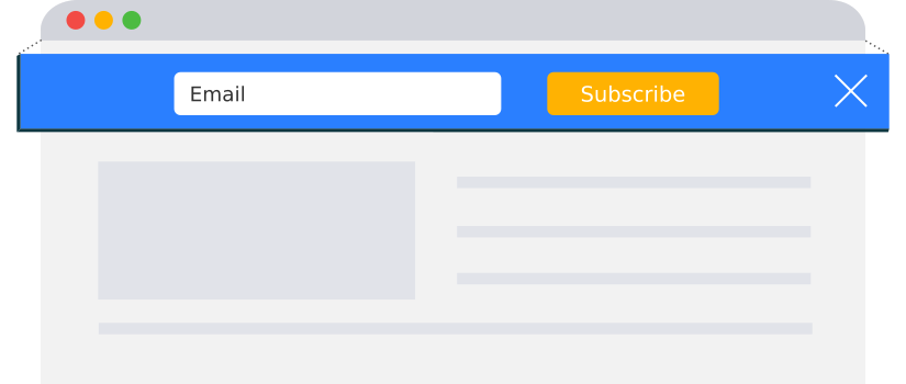
You’ve got mail!
What began as a happy thought, web marketers turned it into dread, and emails found themselves headed straight towards spam. Not a happy thought for marketers that had been tiptoeing the line of annoyance. Then came Opt-in forms and all was well in the world again.
Opt-in forms a win-win solution for e-commerce websites as well as web users. It is permission given by users to a third party, allowing them to send emails with product sales, services, newsletters, and advertisements. On visiting a website, users have begun to get an Opt-in option in the form of a pop-up, dedicated landing page or widget, letting them know that they can stay connected with the website, and can Opt-out of it anytime they like. Giving users this option isn’t just polite, it is also the legal way of sending bulk emails.

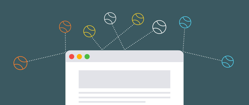
Example of an Opt-in form
What have Opt-in Forms got to do with you?
You may have seen Opt-in forms, and you probably already agree that they are brilliant but the question is what do they have to do with you, or specifically your website? The answer is simple, email leads.
When a web user visits your website, you have converted a stranger into a visitor, this drives in your traffic. Once the visitor is given a choice to Opt-in to receiving email updates, you have converted the visitor into a lead. A lead on engaging with your website becomes a customer, and if the customer is happy with what you do, chances are he or she will share your work with other people that might become your visitor and the cycle will begin again. It’s a good business model, and implementing an Opt-in form in your website or blog is also very easy. Check out best email marketing software, best digital marketing tools and WordPress newsletter Plugins.
What about the Bounce Rate?
All of us are guilty of being annoyed by a pop-up asking us to subscribe. Most of us would have had a bad experience and would have left the site immediately. This brings us to the question of an impact on bounce rate in lieu of the subscription rate.
A test on pop-ups on subscriber conversion from HubSpot’s Dan Zarrella showed a significant increase in conversions to subscribers to over 3%. Testing with a variety of pop-ups, he saw that the bounce rate with an Opt-in form pop-up was 75.66% while the bounce rate without an Opt-in form pop-up was 75.13%. On the other hand, with the Opt-in form pop-up the subscription rate was 3.08% and without it was 1.52%. The study showed that although the bounce rate increased by a little margin, the subscription rose significantly higher. This meant, an increase in the number of loyal customers that would return.
Another study conducted by Matthew Woodward showed the conversion effect of subscriptions before and after an Opt-in form pop-up. The study is shown in the picture below:
Visitors | # Subs Before | # Subs After | +/- |
| 100 | 0.85 | 1.23 | +0.38 |
| 1,000 | 8.5 | 12.3 | +3.8 |
| 10,000 | 85 | 123 | +38 |
| 50,000 | 425 | 615 | +190 |
| 100,000 | 850 | 1,230 | +380 |
Subscription conversions before and after a pop-up
The study conducted on Matthew’s blog showed an increase in the number of visitors along with an increase in the number of subscribers. Although he found pop-ups annoying, he actually saw an increase in visits and subscriptions, which made it clear, that Opt-in forms worked!
So how do you install an Opt-in form on your blog or website?
Installing an Opt-in form is easy. If you use WordPress, you can install a free plugin and get to work. Or you can use the services of OptinMonster or AWeber, two email marketing platforms to implement an opt-in form on your website. Check out HubSpot vs Mailchimp, Constant Contact vs Mailchimp, ActiveCampaign vs HubSpot, Hubspot vs salesforce, Zoho vs Hubspot, ActiveCampaign vs Mailchimp, Sendinblue vs Sendgrid, Sendinblue vs Mailchimp.
What Types of Opt-in Forms are Available?
There are about three types of Opt-in forms that you can use, depending on the type of consumer base you want.
- The Single Opt-in form lets web users add themselves to your mailing list, even if they do not want to join it. It creates a larger database but without quality consumers.
- The Double Opt-in form allows users to click on an activation link sent to their email to approve their subscription request. The advantage of this is that the consumer doesn’t just get added to your mailing list, but also approves your request to inform them about any updates via email.
- Multiple Opt-in forms ask users a simple yes or no question about whether or not they wish to become subscribers. Once they answer, they are taken to the double opt-in form. The advantage of this type of form is that once the user answers yes, he or she makes a mini-commitment and more often than not, follows through on it.
So Which One Works?
A study conducted by GetResponse to see which Opt-in form was better showed the following response.
Double Opt-in Subscriber Count | Single Opt-in Subscriber Count | |
| People who complete your Opt-in form | 10,000 | 10,000 |
| People who complete the double Opt-in confirmation process (assuming 25% don’t) | 7,500 | |
| People who entered their fake names, or mistyped their email address (10%) | 9,000 | |
| Hard bounces- 1% for double Opt-in emails, 2% for single Opt-in emails | 7,425 | 8,820 |
Subscriber study conducted by GetResponse
The study showed that the subscribers that went through the double Opt-in form tended to be more loyal than the people who saw a single Opt-in form.
How have Opt-in Pop-Ups Evolved through the Years?
Pop-ups went from being extremely intrusive to mildly obstructive. A decade ago, pop-ups would blink in a user’s face, or open a series of pop-up windows, that would take ages to close. An experience that would only frustrate a web user. However, with time, pop-ups evolved and what we see today are the byproducts of researches that tried to enhance a user’s online experience.
The evolution is as follows:
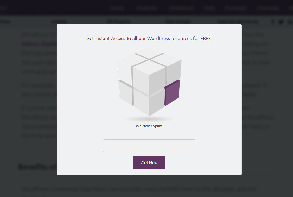
Pop-over
This sort of form is highly common, as it tends to pop up and obscures the content from view. Most webmasters refuse to use it as they feel that it may increase the bounce rate.
In Post
This type of pop up works if you have on display some really good content. Visible in between or at the end of the post, the pop-up asks users if they would like to know about similar posts. This sort of pop up is effective only if you are sure that the content quality will be appreciated by visitors.
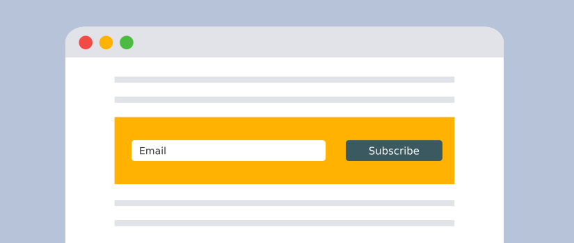
Opt-in Bars
A small strip on the top or the bottom of the page, asking users to subscribe. The advantage of the Opt-in bars is that it isn’t intrusive, the downside, however, is that users might actually miss it, or may not feel the need to subscribe.
Feature Box
Very similar to Opt-in bars, a feature box displays the Opt-in form only until the user opts in, after which it simply displays posts or pages that are featured. Although it has the same downside as Opt-in bars, it tends to use the space for other purposes after someone has subscribed.
Exit-Intent Box
This type of box is highly effective in keeping a visitor longer, as it pops up only when a user is about to close the window. Easy to inculcate, the drawback is that the number of subscribers may be less than expected.
Lightbox
Diverting attention could be another way of explaining this form. The box pops up on the website darkening the text behind it, if a user wishes to ignore it, they can click anywhere on the darkened screen and the pop-up will vanish. Although some people find it intrusive, it is highly effective in gaining subscribers.
Slide-in Box
This type of form slides in when the user is scrolling through your website or blog. It is less intrusive than the lightbox but solves a similar purpose. The advantage of it is that it can be timed such that it doesn’t impact a visitors flow.

Splash Page
A short page that splashes on the screen for first-time visitors. Also known as squeeze pages, allow visitors to become part of the mailing list, however, if the visitor returns, he or she is left alone. This type of pop up is believed to be a little pushy, but it is becoming extremely popular.
Why have Pop-Ups Evolved?
The evolution of pop-ups was done due to the increase in the level of annoyance and laws getting strict. The evolutions end goal was to keep e-commerce running without affecting the user experience. The goal was attained owing to these reasons:
Google’s strict guideline: Google has always tried to enhance user experience and annoying pop-ups were a roadblock. Hence, it decided to crack down on intrusive pop-ups. This was bad news for marketers since SEO traffic for websites showing pop-ups was decreasing. This lead to a pop-up evolution. Marketers had to stop thinking about themselves, but focus on what they were offering to web users. The focus had to shift towards enhancing the user experience or lose out on SEO rankings. Check out the best digital marketing tools.
UX/UI evolution: From the UX/UI point of view, pop-ups were their least liked element. Google’s crackdown, however, gave UX/UI the chance to enhance this element in a way that it would become less intrusive. The pop-ups evolution began to happen. It went from popping up on separate windows to appearing right in the first few seconds of opening a page. With the evolution of pop-ups, the engagement increased, and since the pop-ups were according to the guidelines laid by Google, the SEO rankings increased as well.
Since the two major players that work to enhance user experience cracked down on pop-ups, they became what they are today. Light-box, Splash pages, and Opt-in bars are just a few that have become the leading Opt-in forms that don’t just look good but are also effective.
Quick Tips for Creating Opt-in-Forms:
First of all, an option form must meet up specific requirements of your target audience. In like manner, it should address the challenges your customers are facing and how you can commit to fixing those issues.
Confused? Well, here are a few tips that can help you come out of this confusion and design an effective opt-in-form and capture pop-ups to capture email leads.
- Make sure the lead generation form is visually appealing. According to studies, on average person spends around 15 seconds on a website. So, this also means you just have 15 seconds to make it or break it through the customer’s mind.
- Although the design does play an important role in deciding customers decision it alone will not do anything. So, this means you need to play around with the content. Telling your audience/customers about the benefits of subscribing and signing up is crucial and needs to be done smartly.
- Next, reducing the number of form fields is also an effective strategy that you just cannot miss. Also, short opt-in forms are perceived as more interesting and convenient.
- Make sure the CTA Button is properly placed and unique. Therefore, the CTA button should be easily visible;e and different from the rest of the text.
- Placing the form above the fold also grabs more attention from the audience.
- Lastly, make sure to optimize the opt-in forms for better conversions.
Which Opt-in Form will Work for You?
With a variety of Opt-in forms available, it can become difficult to choose what works best for you. The answer is simple, less is more. You can use a variety of Opt-in forms and annoy your visitors, or you could work on finding what fits best with your website or blog. Work on nudging a user once to subscribe rather than distract him or her from your work. Give more than one Opt-in form a chance and record the statistics to see what works best for you and your users.
Another thing to keep in mind is to stick to Google’s guidelines which focus mainly on user experience. Try to see your pop-up from the eyes of a user and understand what your user wants. Offer them services they cannot refuse or add quality content. Focus on the theme and the pop-up that works best. Check out the best digital marketing tools.
[bctt tweet=”Enhance User Experience, stay in the good books of Google. Reach your Marketing Goals.” username=”templatetoaster”]
Nonetheless, more often than not you may feel that the free theme on WordPress or any other site doesn’t work for you. In a scenario like that, you can opt to build your website from scratch and choose or design Opt-in forms that work best for you. However, if you cannot code that may be a problem, and in that case, you can try TemplateToaster, a web design software that will allow you to design your own theme that is SEO friendly, offering full compatibility with all types of Opt-in form plugins.
Build a Stunning Website in Minutes with TemplateToaster Website Builder
Create Your Own Website Now
Nice article … Great tricks for E-marketing !!!!!!!!!!
Greetings from sntechno.com ….
Thanks for the great content. Love the visual samples.
If the bounce rate is 2% than what will happen?